These days, attention spans are fleeting and competition is fierce, which means that crafting an effective ad is a must if you want to get noticed. When it comes to out-of-home (OOH) media — specifically billboards — you typically only have a few seconds to capture audience attention, create a lasting impression, and drive desired actions.
There’s both an art and a science to designing compelling and impactful billboard ads.
From understanding how people engage with this form of media to harnessing the power of visuals and messaging, we’ll explore key strategies to help you create billboard advertisements that command attention and drive results.
Table of contents
Gauging the Effectiveness of a Billboard Ad
To best understand the impact of your billboard ad on your target audience and determine your campaign’s return on investment (ROI), you’ll want to track and evaluate a few key performance indicators (KPIs).
We won’t really dive into billboard ROI in this post so check out our post on calculating billboard ROI for more on the subject.
One of the primary methods for measuring effectiveness is through tracking audience engagement metrics. This will look different from advertiser to advertiser depending on the desired outcome of your campaign. Some examples of audience engagement metrics that can result from a billboard ad include:
- Foot traffic to a brick and mortar location
- Website visits
- Website conversion rates (e.g. application/form submission, online purchases, etc.)
- Phone calls
- Social media engagement
Maybe the goal of your billboard ad is less tangible than the factors listed above — like brand lift, which measures any increase in brand awareness or favorability following the ad’s placement. Maybe this brand awareness results in an investigative online search that doesn’t necessarily end in a purchase. Or maybe someone will recall your brand when they’re looking to purchase something that you offer.
Lastly, don’t underestimate the power of a survey. Instead of attempting to guess what your target audience is thinking, just ask them! Surveying can help reveal the level of brand recall as well as people’s opinions towards the ad.
Overall, evaluating these factors enables you to refine your strategies and optimize future campaigns, which we’ll get into later.
Tailoring Your Ad to Your Audience
Any seasoned marketing or advertising professional can tell you that “the general public” doesn’t exist. Values, interests, behaviors, and demographics vary wildly across populations. Naturally, this means that not all designs and messages will resonate with distinct audiences.
Whether it’s considering the age, gender, or interests of the audience likely to encounter your billboard, or understanding the specific location and context in which they’ll see it, every aspect of your ad should be carefully crafted to speak directly to your intended viewers. Buyer personas are extremely helpful here.
Tailoring your ad to your target audience might involve using language, imagery, and themes that align with their demographic, values, and aspirations, or even incorporating elements of local culture or vernacular to establish a deeper connection. People will connect and notice the extra work you put in to be relevant.
Best Practices: Billboard Design
Now let’s get into the fun stuff: designing an effective ad!
When it comes to OOH design, less is always more.
Viewers are most likely to be driving by so view time is generally short. Industry insiders often say that viewing time (when not in traffic) is anywhere between 4-8 seconds. That’s why it’s important to get right to the point and have a clear message. An eye-catching graphic, snappy call to action, and your company’s logo are enough to effectively relay your message.
When advising advertisers on billboard ad best practices, we suggest:
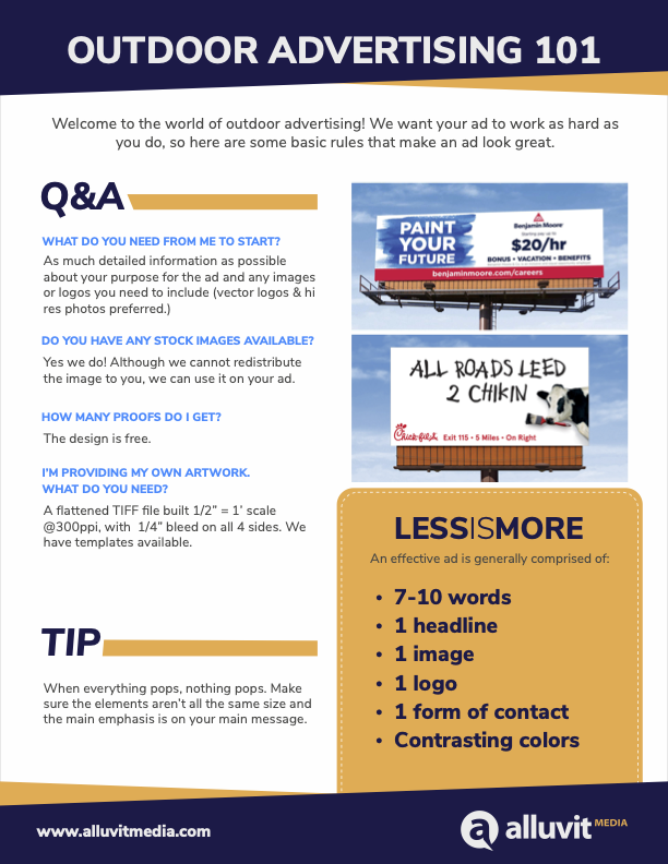
- 7-10 words
- 1 headline
- 1 image
- 1 logo
- Website
- Contrasting colors
The mistake we see most often is advertisers cramming too much information onto their board. It can be tempting to include your website, phone number, slogan, and anything else you typically forefront on your website. However, designing an effective ad involves recognizing the minimum amount of information needed to produce the maximum impact possible.
In the same vein, we like to say “when everything pops, nothing pops”. In other words, there should be a hierarchy of importance in your design elements. If everything’s the same size, you’ll run out of space quickly and passersby won’t retain the most important information.
Just as you would when writing a landing page for your website, consider your billboard ad keywords. If you’re running a recruitment campaign, be sure to have the word “hiring” jump out at viewers. Some strategic secondary keywords could be “bonus”, “flexible”, and “benefits”.
Best Colors for Billboard Advertising
Choosing the best colors for billboard advertising is essential for ensuring that your message is not only seen but also remembered. Here are some things to keep in mind when selecting the best colors for your billboard ad:
- To maximize readability (especially from a distance), use high contrast combinations such as black text on a white background or vice versa
- Be consistent with your brand’s colors. This will strengthen brand recognition and association, making your billboard instantly identifiable to your target audience
- Incorporate attention-grabbing hues like red, yellow, or orange to make your ad stand out
- Ensure legibility by selecting colors that offer enough contrast between text and background, avoiding combinations that hinder readability. Take a look at a color wheel if to identify what colors work best together
What are Billboard Specs?
Billboard specs, or specifications, refer to the technical requirements and guidelines that advertisers need to follow when designing and submitting billboard advertisements. We always provide our advertisers with spec sheets specific to their placement to ensure that there are no hiccups in the launch process.
Billboard specifications typically include details such as:
- The dimensions of the billboard
- Resolution and file format requirements for graphics
- Color mode
- Bleed and safety margins
- And any other considerations related to materials and installation
Adhering to billboard specs ensures that ads are properly formatted, legible, and visually appealing when on display. If these specifications aren’t properly addressed, your ad could appear warped, cropped, discolored, or just not as originally envisioned.
If you’re not confident in your design skills, don’t worry. We offer free graphic design services to eliminate any creative barriers you might encounter otherwise.
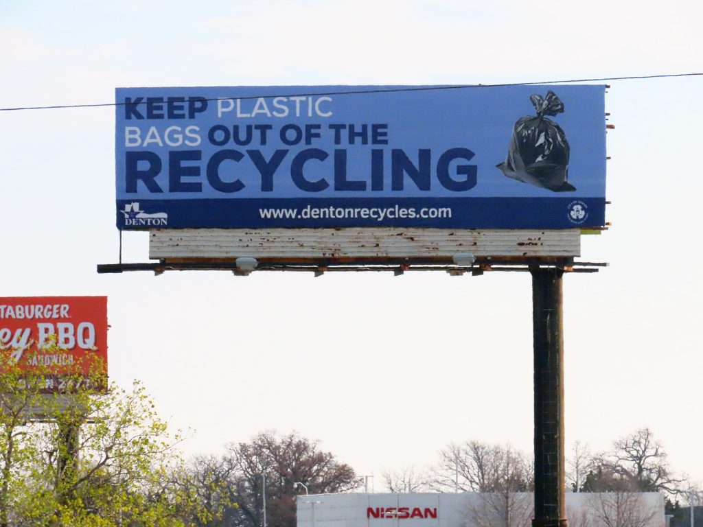
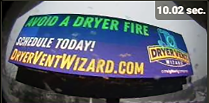
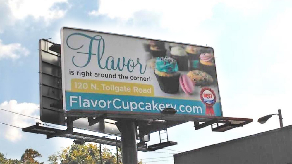
Examples of Great Billboard Ads
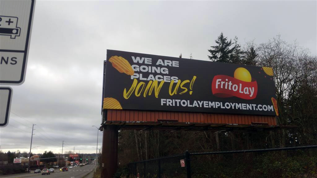
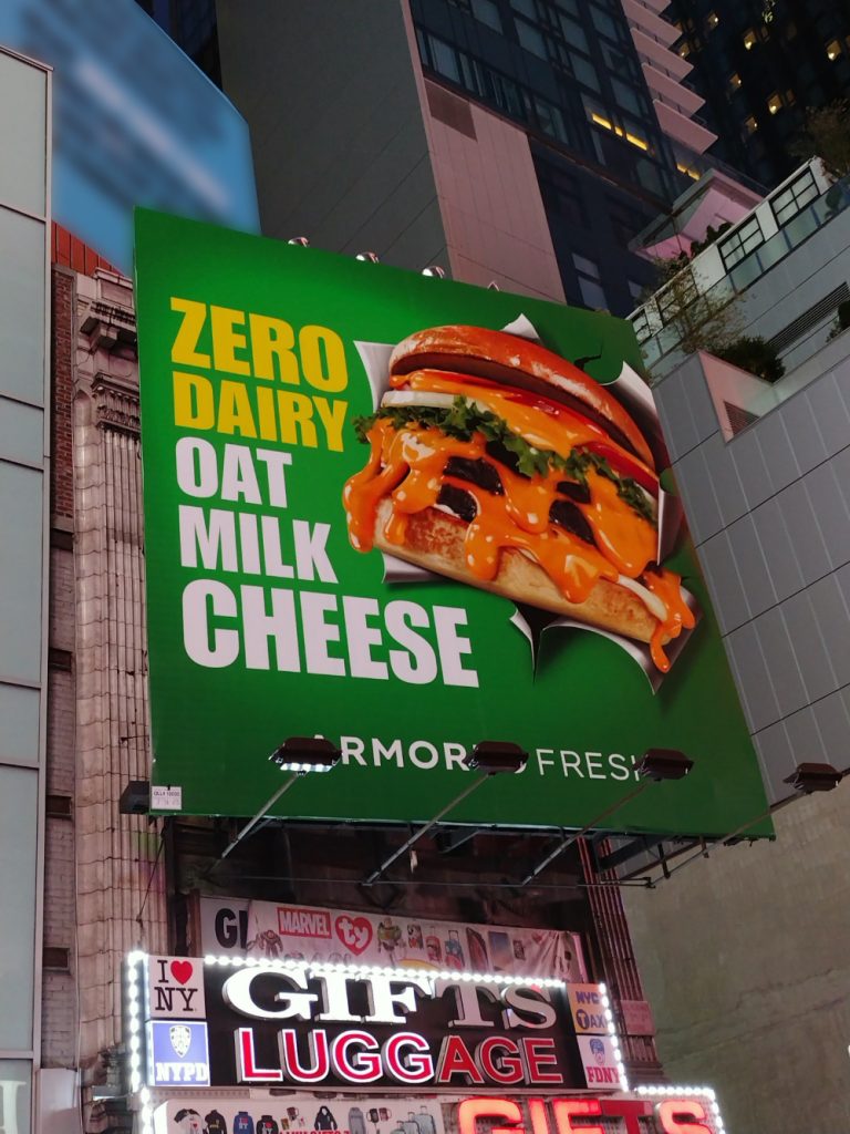
We’ve compiled some billboard ad examples to demonstrate how powerful an effective design can be. All of the following are from campaigns that we helped launch.
FAQs
What’s the biggest mistake people make when designing a billboard?
Hands down: too much information. Billboards aren’t brochures. Packing in multiple headlines, long URLs, phone numbers, and dense imagery overwhelms viewers and dilutes your message. A single strong headline, one visual, and your logo or website is often all you need.
What colors work best for billboard ads?
High-contrast combinations are your friend. Think dark text on a light background or the reverse. Incorporate attention-grabbing hues sparingly, keep branding consistent, and make sure your text stands out from any imagery behind it. If your colors don’t pass the “instant readability” test, adjust them.
Do billboard specs really matter?
They matter a lot. Specs ensure your ad prints correctly, stays proportional, and appears exactly as intended once installed. Ignoring requirements like resolution, dimensions, or bleed guidelines can lead to warped images, cropped text, or color issues—none of which you want on a 40-foot display.