Restaurant Billboard Ad Ideas and Examples

What’s unique about restaurant billboards?

Deciding where to eat is one of the fastest decisions anybody makes, and it usually gets made in the car with somebody hungry in the passenger seat. A billboard is in front of people during that window, and it doesn't ask anyone to open an app or run a search first.

40+ restaurant campaigns we ran
30+ restaurant advertisers
20+ US markets

Almost every board here is working on one of two problems. The first is appetite, and the answer is a photograph big enough and close enough to do the work on its own. The second is getting there, and the answer is an exit number, a landmark, or a turn somebody can still make.

The ones that do both put the food on one half and the directions on the other, so neither has to share space with the other.

Jump to an example
  1. A U-turn arrow instead of an address
  2. What they serve, then the exit number
  3. A burger ad for a cheese brand
  4. The word free, before the details
  5. The name is also the directions
  6. A line people read out loud
  7. Name, food, address, phone, nothing more
  8. The town name in the first line
  9. A national app, one local store
  10. No headline, just pancakes
  11. A board built for one date

1A U-turn arrow instead of an address
Mahzu East Windsor restaurant billboard campaign in East Windsor, NJ
Mahzu East Windsor restaurant billboard campaign in East Windsor, NJ, installed See it on the road East Windsor, NJ
Advertiser
Mahzu East Windsor
Format
Poster, static
Market
East Windsor, NJ
Ran
July 2025

Why it works

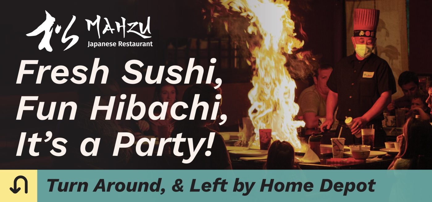
The column of flame is why your eye lands here at all. It's a photograph of the hibachi table with guests around it, so the board is selling the evening rather than the food. White type on the dark half of the picture keeps the three line promise readable. The teal strip along the bottom is the part worth copying: a U-turn arrow in a yellow square, then turn around, and left by Home Depot. It accepts that you have already gone past and tells you how to fix that, using a landmark everybody knows.

The idea you can borrow

If your board sits past the turn, say so. A U-turn arrow and a landmark people recognize will recover a customer that a street address would lose.
2What they serve, then the exit number

Bohemian Bull restaurant billboard campaign in Greer, SC
Bohemian Bull restaurant billboard campaign in Greer, SC, installed See it on the road Greer, SC
Advertiser
Bohemian Bull
Format
Digital Billboard
Market
Greer, SC
Ran
October 2024

Why it works

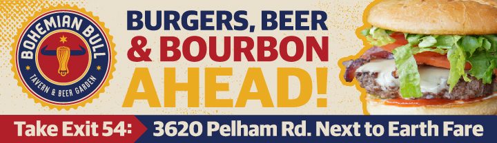
Burgers, beer and bourbon tells you what kind of night this is in three nouns. Ahead turns it into something close rather than something far away. The burger is shot warm and tight, and it runs off the edge of the board so it reads bigger than the space it's in. The band underneath splits in two: take exit 54 in red, then the address and next to Earth Fare in navy. The exit number is what gets somebody there, and a supermarket is easier to picture than a street number.

The idea you can borrow

Name what you serve rather than describing it. Three concrete nouns tell people whether they want it, and a nearby landmark tells them how to find it.

3A burger ad for a cheese brand

Armored Fresh restaurant billboard campaign in New York, NY
Armored Fresh restaurant billboard campaign in New York, NY, installed See it on the road New York, NY
Advertiser
Armored Fresh
Format
Bulletin
Market
New York, NY
Ran
August 2022

Why it works

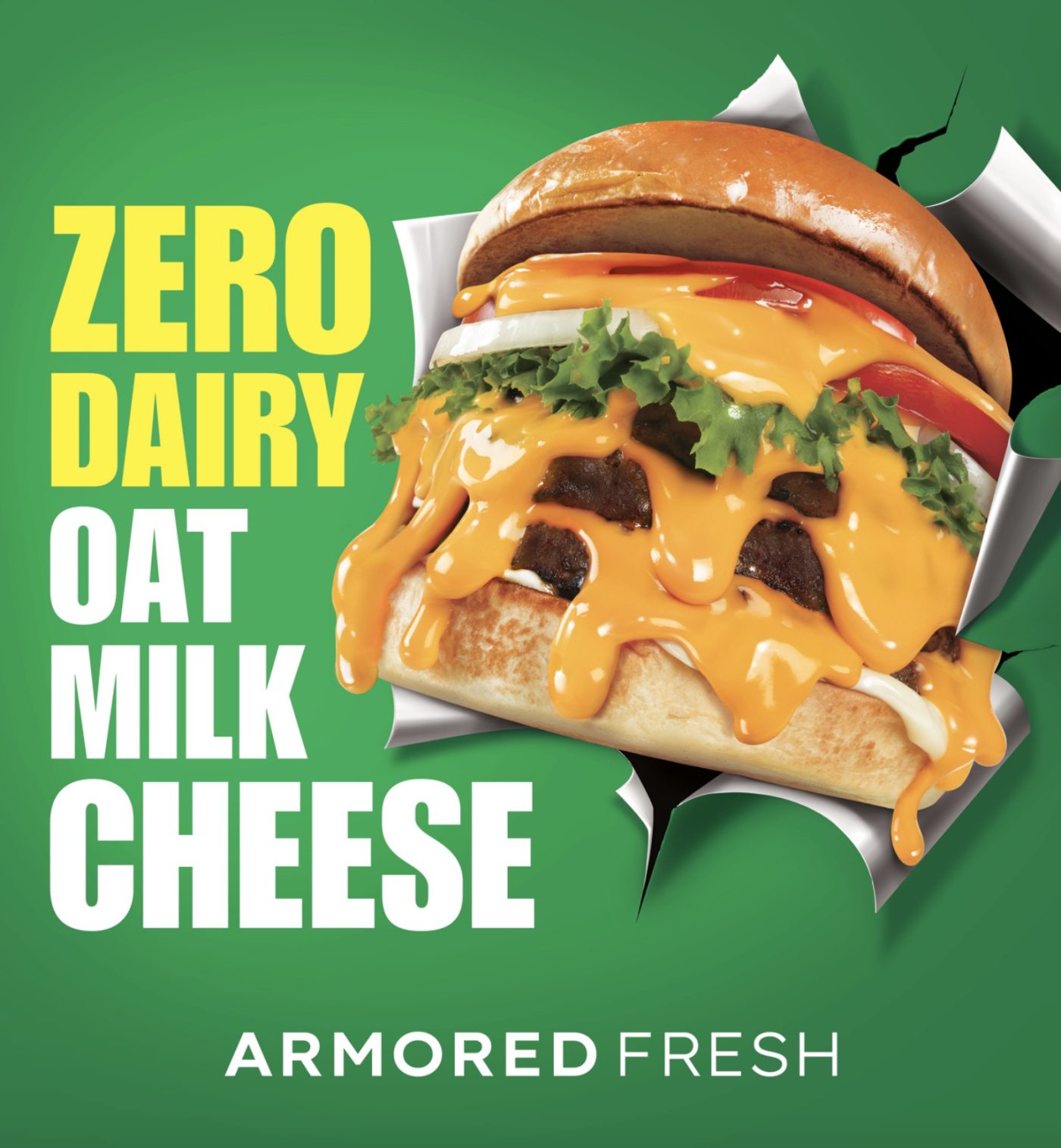
The picture is a cheeseburger with the cheese running down the sides of it. The headline is zero dairy, oat milk cheese. That pairing is the whole idea. The proof people want from a dairy substitute is that it melts and drips like the real thing, and a photograph shows that faster than a claim can. Zero dairy sits in yellow and the rest in white, so the two halves read as separate pieces. The burger bursts through torn paper, which lets it run past the edges of a square board. There's no address, no web address and no phone number. That suits a board in Times Square, where the crowd is on foot and the only thing to take away is the name.

The idea you can borrow

If people have a doubt about your product, photograph the answer to it. A substitute that melts on camera settles the question before the copy has to say anything.

4The word free, before the details

Jet's Pizza restaurant billboard campaign in Monroe, MI
Jet's Pizza restaurant billboard campaign in Monroe, MI, installed See it on the road Monroe, MI
Advertiser
Jet's Pizza
Format
Poster, static
Market
Monroe, MI
Ran
February 2025

Why it works

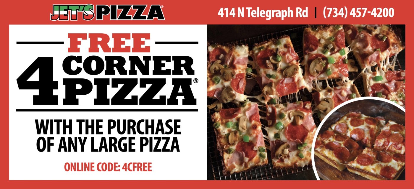
Free comes first and in red, and the 4 underneath it is the largest thing on the board, so the offer arrives in two beats. The rest follows at a size you can take in at a glance. The online code at the bottom gives the offer a way to be used and counted. The pizza fills the right half, shot from above with the toppings sharp, and a round inset shows one corner piece so the shape of it is clear. Red, black and white is the brand's own palette. The address and phone sit in the bar across the top, out of the way of the offer but still on the board.

The idea you can borrow

An offer with a real number or a free item will outperform a slogan. Put it in the largest type and give people a code, so you can tell whether the board worked.

5The name is also the directions

Flavor Cupcakery restaurant billboard campaign in Bel Air, MD
Flavor Cupcakery restaurant billboard campaign in Bel Air, MD, installed See it on the road Bel Air, MD
Advertiser
Flavor Cupcakery
Format
Poster, static
Market
Bel Air, MD
Ran
July 2023

Why it works

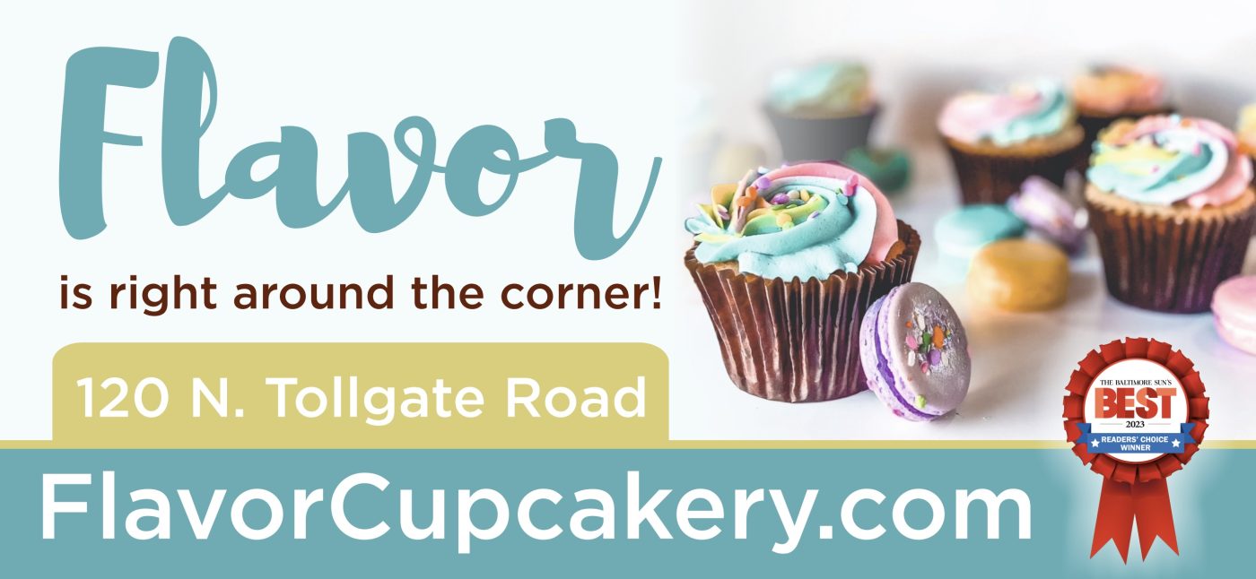
Flavor is right around the corner uses the name as the promise, and it reads naturally enough that you don't notice it working. The cupcakes are photographed against white with the frosting catching the light, which is all a cupcake needs. Teal and cream keeps the whole thing soft. The address and the web address sit in two separate bands, khaki above and teal below, so they read as two pieces of information. The readers' choice rosette in the corner is the kind of small proof that's worth the space it takes.

The idea you can borrow

If your name can carry the message, let it. A line that works as both a brand and a direction is doing two jobs in the same space.

6A line people read out loud

Citrus The Diner restaurant billboard campaign in Denver, NC
Citrus The Diner restaurant billboard campaign in Denver, NC, installed See it on the road Denver, NC
Advertiser
Citrus The Diner
Format
Bulletin, static
Market
Denver, NC
Ran
March 2025

Why it works

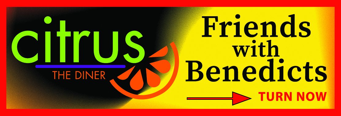
Friends with Benedicts is the kind of line people read out to whoever is in the car with them. The board gives it room by fading from black on the left to yellow on the right, with the logo on the dark end and the line on the bright end, so nothing overlaps and both stay readable. The orange citrus slice sits where the two meet and ties them together. Underneath, a red arrow and turn now give a driver something to do about it.

The idea you can borrow

A line worth repeating buys you more attention than a list of what's on the menu. If you have one, clear the board and give it room.

7Name, food, address, phone, nothing more

Kobe Sushi and Hibachi restaurant billboard campaign in Davenport, IA
Kobe Sushi and Hibachi restaurant billboard campaign in Davenport, IA, installed See it on the road Davenport, IA
Advertiser
Kobe Sushi and Hibachi
Format
Digital Billboard
Market
Davenport, IA
Ran
March 2025

Why it works

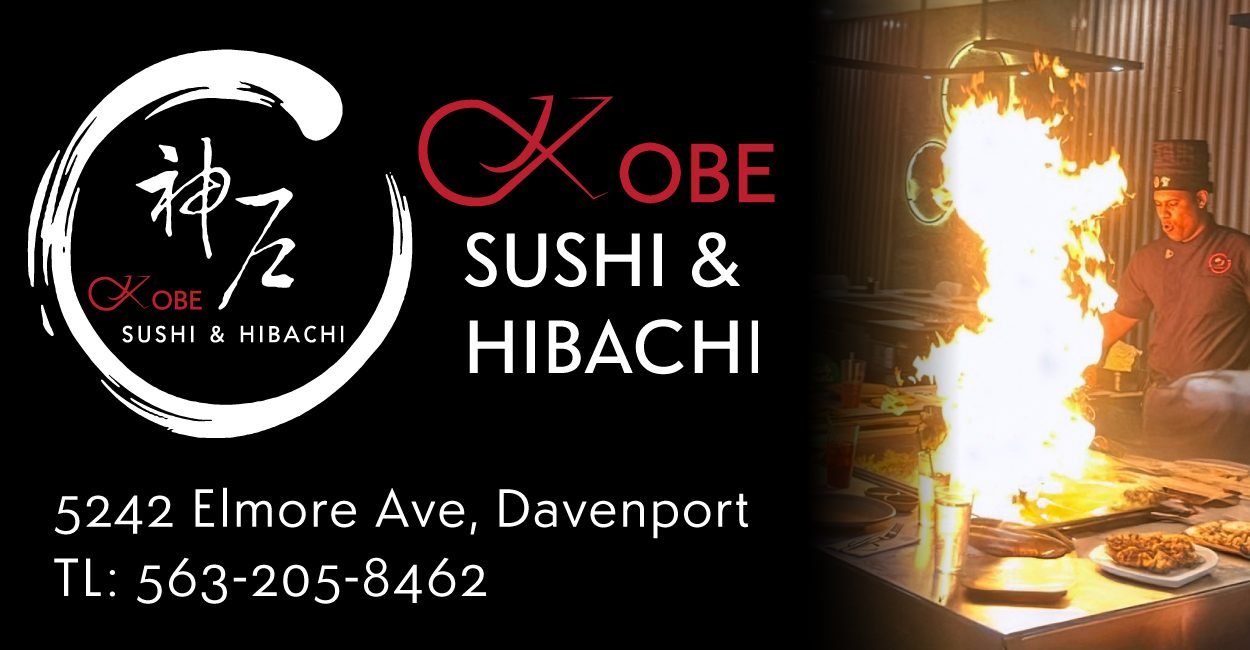
This one sticks to four things: who they are, what they serve, where they are, and how to call. On a screen that could carry motion and color, choosing black and still makes it read like a restaurant rather than an advertisement. The photograph of the grill mid flame brings the warmth, and the red in the logo picks up the same tone so the palette stays tight. The address and phone sit at the bottom left in white, where nothing else is competing for that corner.

The idea you can borrow

Not every board needs a clever line. Name, category, address and phone, set cleanly, will do the job for a place people simply need to find.

8The town name in the first line

Cygnus Home Service (Schwan's) restaurant billboard campaign in Marshfield, WI
Cygnus Home Service (Schwan's) restaurant billboard campaign in Marshfield, WI, installed See it on the road Marshfield, WI
Advertiser
Cygnus Home Service (Schwan's)
Format
Poster
Market
Marshfield, WI
Ran
December 2022

Why it works

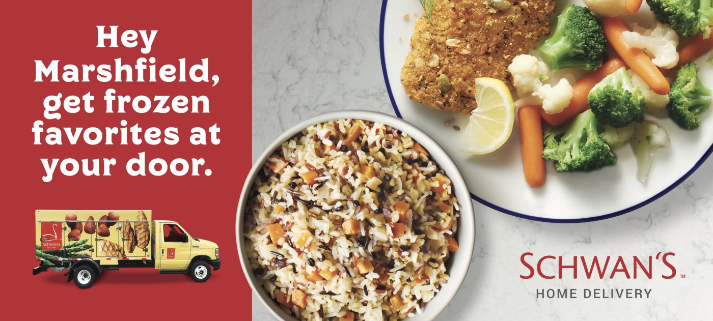
Hey Marshfield is the first thing on the board. Naming the town is what makes a service that runs across the country feel like a local one. The red panel keeps the whole message on the left. The right two thirds is food photographed from above on a marble counter, which is the view people already know from recipes. The yellow truck sits under the copy at a size you can still make out, and it's the part that explains what the service actually is. The name in the corner is the only thing you need to take away.

The idea you can borrow

The town name is the cheapest way to make a service that runs everywhere feel like a local one. It costs one word and it tells people the board is about them.

9A national app, one local store

Flashfood restaurant billboard campaign in Catonsville, MD
Flashfood restaurant billboard campaign in Catonsville, MD, installed See it on the road Catonsville, MD
Advertiser
Flashfood
Format
Poster
Market
Catonsville, MD
Ran
November 2021

Why it works

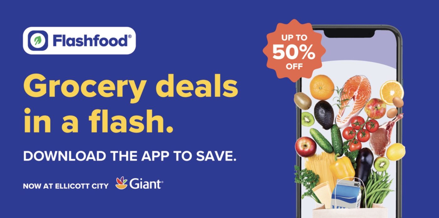
Grocery deals in a flash is the plain version of what the app does. The small line underneath is what makes the board worth buying on this road: now at Ellicott City Giant. An app works anywhere, so the useful thing to say is which store near you has it. Download the app to save is the instruction, set in white under the yellow headline so the two read in order. On the right, the groceries spill out of a phone screen into a paper bag, which explains the app without showing a screenshot of it. The orange starburst is the only warm color on the board, and it's carrying the number, up to 50% off.

The idea you can borrow

If what you sell works everywhere, name the store people can use it at. One line turns a national message into something that applies on the road the board stands on.

10No headline, just pancakes

IHOP restaurant billboard campaign in Clovis, NM
IHOP restaurant billboard campaign in Clovis, NM, installed See it on the road Clovis, NM
Advertiser
IHOP
Format
Bulletin, static
Market
Clovis, NM
Ran
October 2021

Why it works

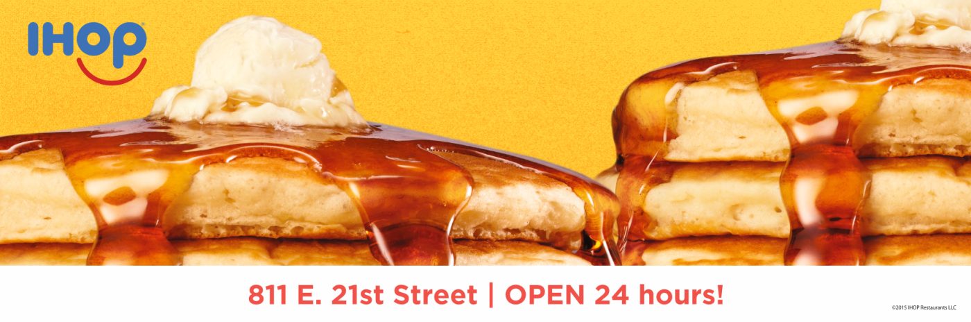
There is no headline on this board. Two stacks of pancakes are cropped so close that the syrup runs off the edges, and the picture does all of the persuading. Everything else is one line along the bottom, the street address and open 24 hours, which is the right pair for a place people think of at hours when little else is open. The yellow behind it is the brand's own color, so the board is recognizable from further out than the logo in the corner is readable.

The idea you can borrow

A photograph can carry a board on its own if it's cropped close enough. When it does, spend the one line you have left on the address and the hours.

11A board built for one date

Kanpai restaurant billboard campaign in Denver, NC
Kanpai restaurant billboard campaign in Denver, NC, installed See it on the road Denver, NC
Advertiser
Kanpai
Format
Digital Billboard
Market
Denver, NC
Ran
October 2024

Why it works

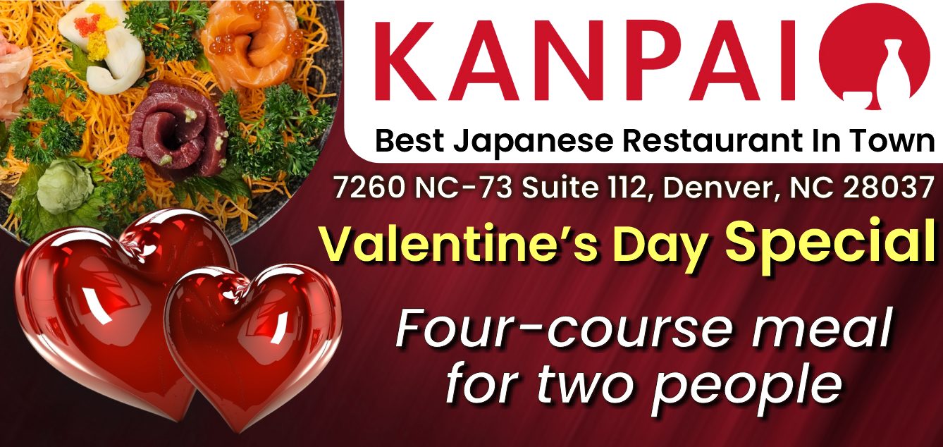
This is a board built for a single date, which only a digital face makes practical. Valentine's Day Special sits in yellow against the dark red, and four course meal for two underneath is the offer, stated plainly. Two red hearts on the left carry the occasion without anybody having to explain it. Above all of it the name and the address stay put, so the board still works as a sign for the restaurant for somebody who isn't booking a table that week.

The idea you can borrow

Digital lets you sell an occasion while it's still coming. Keep the name and the address in place so the board still works as a sign once the offer ends.

What the best restaurant billboards have in common

Every campaign above ran through Alluvit Media. We secured the space, the board went up, and we photographed it after install, so these are real boards on real streets rather than concept art. Looking across them, the same handful of things keep showing up:

  • One idea. Carried in few enough words to land in the seconds a driver actually has.
  • Type you can read at distance. Heavy enough letters, real contrast behind them, and one color that pulls the eye where it needs to go.
  • Built for a billboard. Work that could only be a billboard, rather than a print ad or a social post enlarged to fit one.
  • One thing to do next. A website, a phone number, or an address, set large enough to remember.
  • It sounds like the advertiser. Creative that sounds like the business behind it and says what they actually wanted said.
  • The right road. A board on a road the right audience already drives, with a message built for that market.

Free design support when you need it

Don't have a graphic design team? No problem. Our designers will create an attention-grabbing ad at no extra cost. All we need from you is a logo and a rough idea of what you want to say.

Some of the advertisers above sent us their own artwork, and that's fine too. Either way, we compare your design to the specs of the actual board to ensure its resolution and that it reads well from the road. We're checking that it holds up after dark, that the type is big enough to catch from that far back, and that there aren't more words than a driver has time for.

Common questions

How much does a restaurant billboard cost?

It depends on the market, the format, and how long you run, which is why we built a billboard cost calculator that gives you a real number instead of a range. Put in a city and a budget and it'll show you what that buys.

How many words should a billboard have?

Seven or fewer is the number most of the boards above land on. A driver gets somewhere between four and six seconds, and that has to cover the message, the brand, and where to go next. The campaigns that read fastest are the ones that picked one idea and let the design carry the rest.

Can we use one of these designs?

The artwork belongs to the advertiser who ran it, so treat these as reference rather than templates. The ideas underneath them travel perfectly well. If you want us to design yours, that comes at no extra cost, and if you'd rather supply your own artwork we'll check it against the specs for the board either way.

Ready to run your own campaign?

Tell us the market and the budget, and we'll come back with what it buys.

Request your proposal