University Billboard Ad Ideas and Examples

What’s unique about university billboards?

Most people who see these boards already want the credential. What stops them is practical: a waitlist, a commute, the time it takes, or a year of credits they don't want to lose. A billboard near the campus reaches those people while the decision is still open.

Almost none of these campaigns are talking to somebody choosing between brochures. They're talking to adults who already want the credential and have run into something in the way: a waitlist, a commute, a year of credits they don't want to lose, or the time a degree takes.

So the boards answer those things directly. No waitlist. Sixteen months. Transfer scholarships available. Here in Murrieta. Each one names the obstacle and removes it in the same line. The other thing they share is proximity. Every board on this page ran in the market its campus serves, which is what lets a line like here in Murrieta work at all.

Jump to an example
  1. Words only, no photograph
  2. The link goes to the program, not the homepage
  3. A transfer route, named by both schools
  4. No waitlist, in the biggest type
  5. The town name is bigger than the college name
  6. Type straight on the photo, no panel
  7. The salary is the headline

1Words only, no photograph
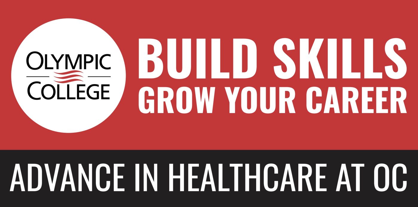
Olympic College university billboard campaign in Port Orchard, WA
Olympic College university billboard campaign in Port Orchard, WA, installed See it on the road Port Orchard, WA
Advertiser
Olympic College
Format
Poster, static
Market
Port Orchard, WA
Ran
May 2026

Why it works

The board is split red over black, and that split does the thinking. Build skills sits on red at the size that carries from the highway, grow your career follows underneath, and the black band at the bottom narrows all of it to one program, advance in healthcare at OC. There's no photograph and no web address, which leaves the type room to be genuinely large. That last line uses the initials rather than the name spelled out in the logo. On a state highway inside the college's own county, that reads as familiarity rather than shorthand.

The idea you can borrow

A board with nothing on it but words can hold the biggest type on the road. If your name is already known locally, spend the space on what you want people to do.
2The link goes to the program, not the homepage

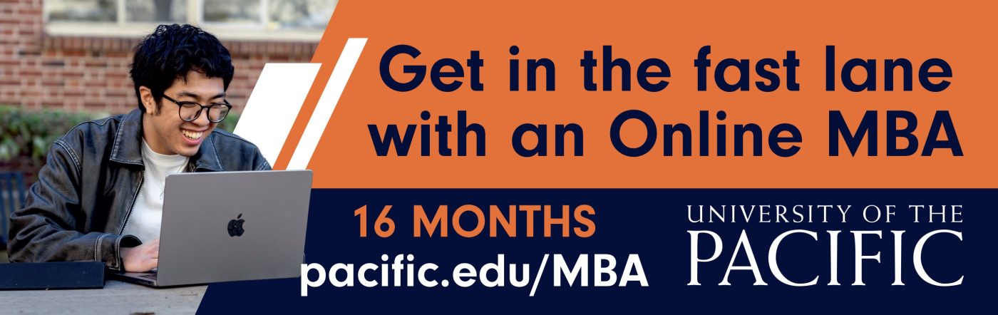
University of the Pacific, Eberhardt School of Business university billboard campaign in Tracy, CA
University of the Pacific, Eberhardt School of Business university billboard campaign in Tracy, CA, installed See it on the road Tracy, CA
Advertiser
University of the Pacific, Eberhardt School of Business
Format
Bulletin, static
Market
Tracy, CA
Ran
May 2026

Why it works

Get in the fast lane with an Online MBA is written for the medium it's running in, and a driver gets it without having to work at it. The headline sits on a coral panel in a friendly rounded face. The navy band underneath carries the two facts that decide it, sixteen months in orange and pacific.edu/MBA in white at almost the same size. The link goes to the program page rather than the university homepage, so the visit lands where the interest was. The photograph of a student at a laptop shows what an online degree actually looks like.

The idea you can borrow

Point the web address at the specific program, not the front door. Somebody who reads a board about an MBA should not have to go looking for it once they arrive.

3A transfer route, named by both schools

Albright College university billboard campaign in Reading, PA
Albright College university billboard campaign in Reading, PA, installed See it on the road Reading, PA
Advertiser
Albright College
Format
Poster
Market
Reading, PA
Ran
June 2025

Why it works

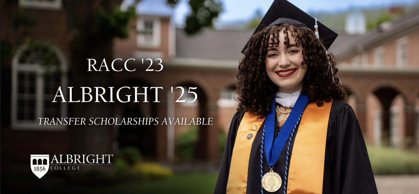
RACC '23, then ALBRIGHT '25, and the story is told. Two years at the community college down the road, two more here, and a graduate in cap and gown standing to the right to show how it ended. Transfer scholarships available sits underneath in small italics, which answers the question the first two lines raise. The campus photograph behind the type is darkened, which keeps the white serif readable while still putting the place on the board. It only works within a few miles of both schools, which is exactly where it ran.

The idea you can borrow

If your audience shares a starting point, name it. Two years and two institutions can mean more to the right person than a paragraph of benefits.

4No waitlist, in the biggest type

Arizona College of Nursing university billboard campaign in Bradenton, FL
Arizona College of Nursing university billboard campaign in Bradenton, FL, installed See it on the road Bradenton, FL
Advertiser
Arizona College of Nursing
Format
Bulletin
Market
Bradenton, FL
Ran
February 2023

Why it works

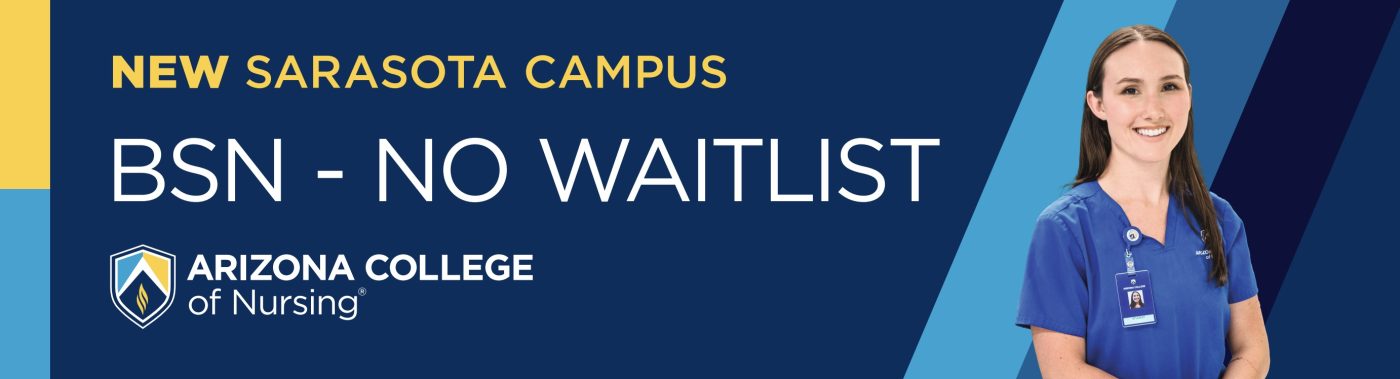
BSN - no waitlist answers the thing that stops most people from starting, and it does it in the largest type on the board. Everything else supports it: new in gold marks the Sarasota campus as news, the shield and wordmark identify the school, and a nurse in scrubs cut in behind a cyan diagonal puts a face to the outcome. Deep navy behind white type keeps it legible, and the gold and cyan slivers on the left edge add color without taking room from the message.

The idea you can borrow

The strongest headline is often the answer to why somebody hasn't signed up yet. Find the objection and put it in the biggest type.

5The town name is bigger than the college name

United Nursing College university billboard campaign in Murrieta, CA
United Nursing College university billboard campaign in Murrieta, CA, installed See it on the road Murrieta, CA
Advertiser
United Nursing College
Format
Digital Billboard
Market
Murrieta, CA
Ran
July 2026

Why it works

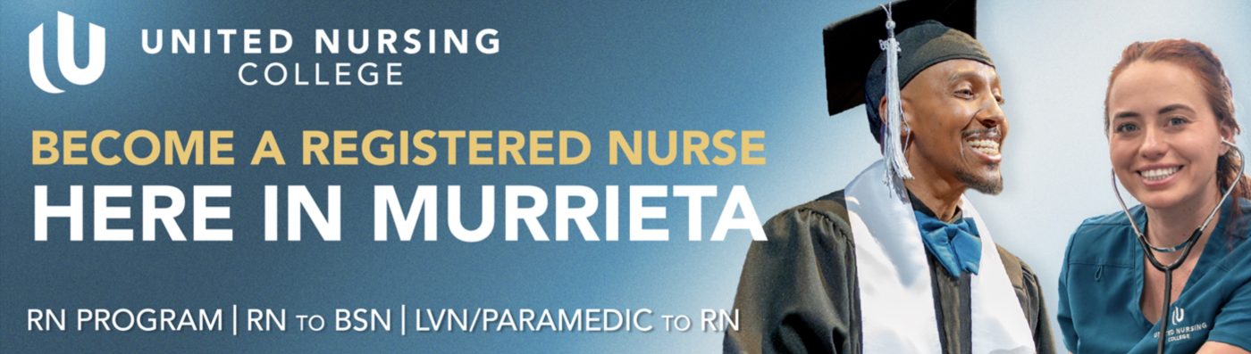
HERE IN MURRIETA is larger than the college's own name. That's the right call for a school whose main advantage is that you don't have to leave town to train. The aspiration runs above it in gold, become a registered nurse, and the two graduates on the right show the finish. Along the bottom, three entry routes sit side by side: RN program, RN to BSN, and LVN or paramedic to RN. People at different stages all find themselves on the same board. A teal to blue gradient holds it together and keeps the gold readable.

The idea you can borrow

When your advantage is location, make the place name the headline. The ways in, listed underneath, let one board speak to several audiences.

6Type straight on the photo, no panel

Arcadia University university billboard campaign in Lawrence Township, NJ
Arcadia University university billboard campaign in Lawrence Township, NJ, installed See it on the road Lawrence Township, NJ
Advertiser
Arcadia University
Format
Digital Billboard
Market
Lawrence Township, NJ
Ran
January 2026

Why it works

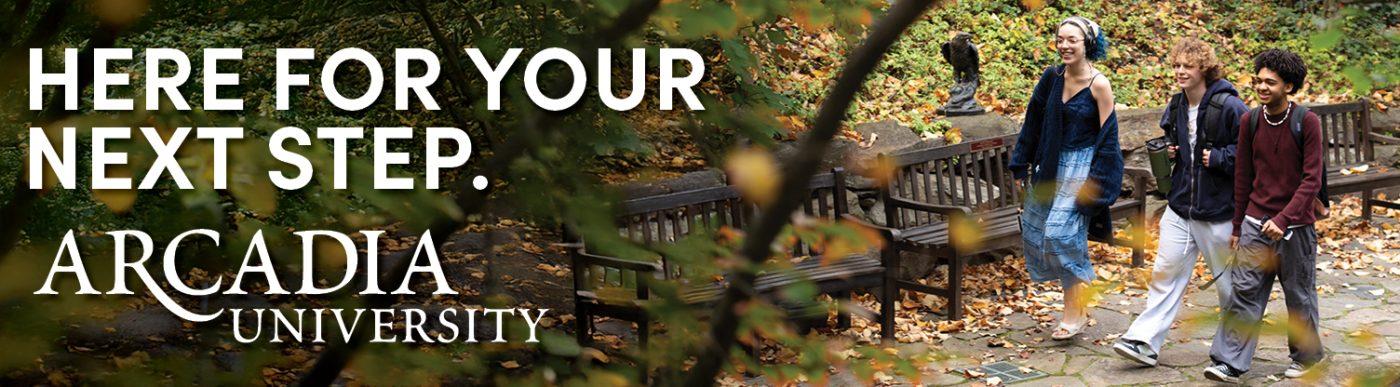
One photograph across the whole board, with the left third darkened so white type can sit straight on it without a panel. Here for your next step is the whole message, and next step is the part doing the work. It fits a high school senior, a transfer student and an adult going back, all at once. The students are walking rather than posed, and the fallen leaves place the board in the season people apply in. There's no web address and no phone number, which is a choice a university with a known name can make when the board is there to keep that name in mind.

The idea you can borrow

Darkening part of a photograph lets you put type straight on it and skip the panel, which keeps the picture whole. Pick the quietest third and hold the words to one line.

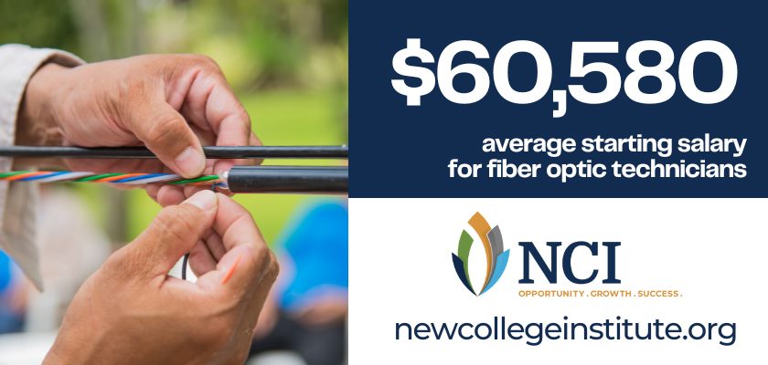
7The salary is the headline

New College Institute university billboard campaign in Lakeside, VA
New College Institute university billboard campaign in Lakeside, VA, installed See it on the road Lakeside, VA
Advertiser
New College Institute
Format
Digital Billboard
Market
Lakeside, VA
Ran
July 2023

Why it works

$60,580 is the biggest thing on the board and it isn't rounded, which is what makes it read as a real figure rather than a claim. The line underneath says what the number is and who it's for, average starting salary for fiber optic technicians, so the board sorts its own audience in seven words. The photograph is a close-up of hands splicing fiber, which shows the actual work rather than a classroom. White on navy carries the number, and the web address gets a white band of its own underneath where nothing competes with it.

The idea you can borrow

A specific number beats a rounded one. $60,580 reads as something somebody looked up, and the line underneath only has to say what it is and who it applies to.

What the best university billboards have in common

Every campaign above ran through Alluvit Media. We secured the space, the board went up, and we photographed it after install, so these are real boards on real streets rather than concept art. Looking across them, the same handful of things keep showing up:

  • One idea. Carried in few enough words to land in the seconds a driver actually has.
  • Type you can read at distance. Heavy enough letters, real contrast behind them, and one color that pulls the eye where it needs to go.
  • Built for a billboard. Work that could only be a billboard, rather than a print ad or a social post enlarged to fit one.
  • One thing to do next. A website, a phone number, or an address, set large enough to remember.
  • It sounds like the advertiser. Creative that sounds like the business behind it and says what they actually wanted said.
  • The right road. A board on a road the right audience already drives, with a message built for that market.

Free design support when you need it

Don't have a graphic design team? No problem. Our designers will create an attention-grabbing ad at no extra cost. All we need from you is a logo and a rough idea of what you want to say.

Some of the advertisers above sent us their own artwork, and that's fine too. Either way, we compare your design to the specs of the actual board to ensure its resolution and that it reads well from the road. We're checking that it holds up after dark, that the type is big enough to catch from that far back, and that there aren't more words than a driver has time for.

Common questions

How much does a university billboard cost?

It depends on the market, the format, and how long you run, which is why we built a billboard cost calculator that gives you a real number instead of a range. Put in a city and a budget and it'll show you what that buys.

How many words should a billboard have?

Seven or fewer is the number most of the boards above land on. A driver gets somewhere between four and six seconds, and that has to cover the message, the brand, and where to go next. The campaigns that read fastest are the ones that picked one idea and let the design carry the rest.

Can we use one of these designs?

The artwork belongs to the advertiser who ran it, so treat these as reference rather than templates. The ideas underneath them travel perfectly well. If you want us to design yours, that comes at no extra cost, and if you'd rather supply your own artwork we'll check it against the specs for the board either way.

Ready to run your own campaign?

Tell us the market and the budget, and we'll come back with what it buys.

Request your proposal