Cannabis Billboard Ad Ideas and Examples

What’s unique about cannabis billboards?

Cannabis is one of the few categories where a billboard is often the first place somebody learns a shop exists, because most of the usual advertising channels are closed to it. That puts a lot on one board: the name, what it sells, and where to turn, all in the time it takes to drive past.

Nearly every board here answers the same three things, and answers them fast: who this is, what they sell, and where to turn.

The ones that go further make the location part of the message, with a drive time, a highway number, or the name of the town in the headline. The other thing they share is a palette they commit to, so the shop is recognizable from further out than the words are readable.

Jump to an example
  1. The same joke twice, for anybody who looks
  2. One honest line about who runs it
  3. Ten minutes, measured from where you are
  4. A considered brand, and blunt directions
  5. Tie dye that still reads
  6. Name, category, address, and nothing else

1The same joke twice, for anybody who looks
Nirvana Center cannabis billboard campaign in Menominee, MI
Nirvana Center cannabis billboard campaign in Menominee, MI, installed See it on the road Menominee, MI
Advertiser
Nirvana Center
Format
Bulletin
Market
Menominee, MI
Ran
June 2023

Why it works

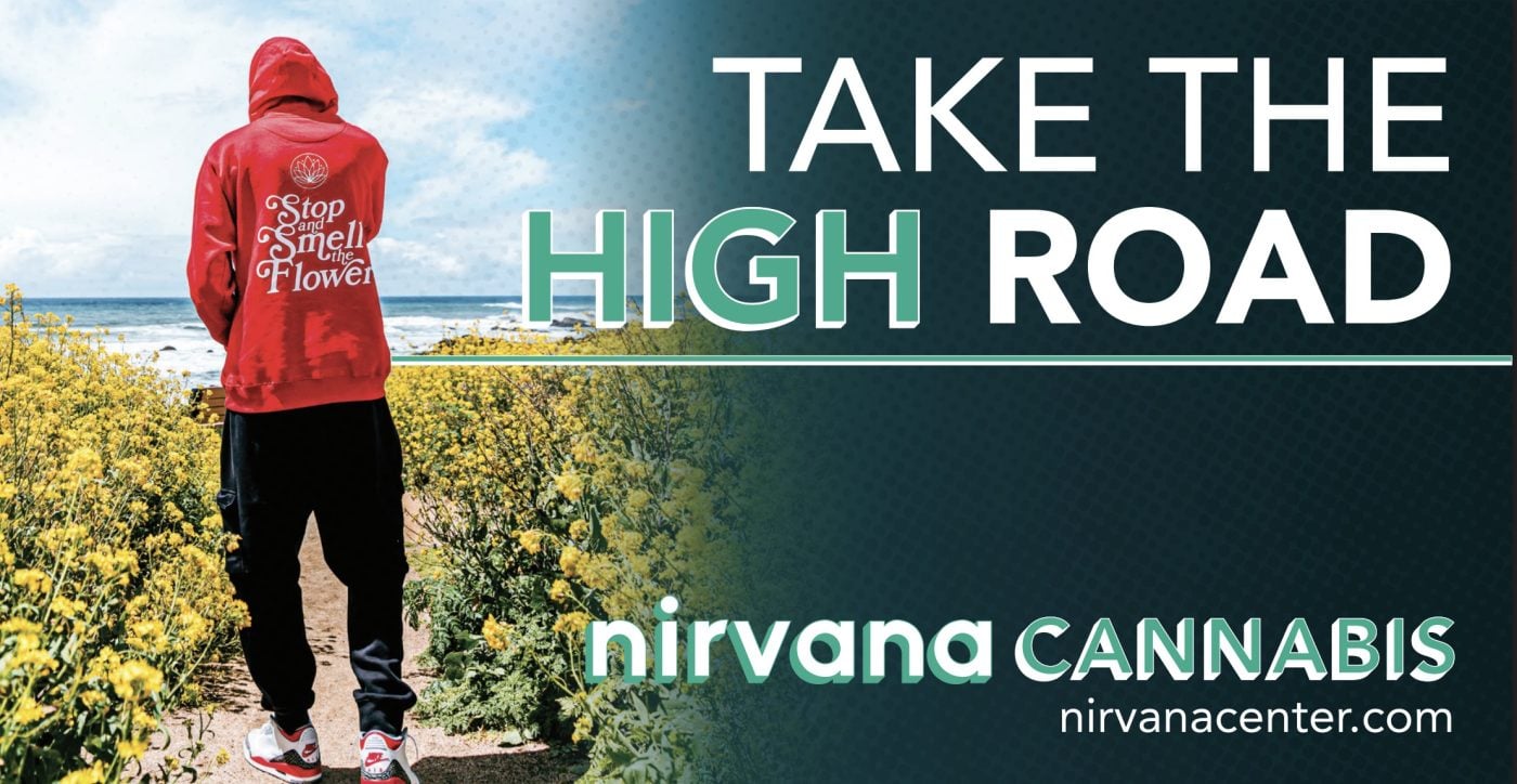
The photograph does most of the work here, and the gradient is what lets it. A person walks away from you up a path through yellow wildflowers toward the ocean, and the picture dissolves into deep green about halfway across, so the type has somewhere clean to sit. Take the high road is a pun, and HIGH set in green makes sure you catch it. The back of the hoodie reads stop and smell the flower, which is the same idea a second time for anybody who looks twice. The name and the web address close the bottom right at a size you can read at speed.

The idea you can borrow

A photograph that runs into a flat color gives you a picture and a clean place for type on the same board. Fade the two together rather than cutting between them, and it reads as one piece.
2One honest line about who runs it

White Atmoss cannabis billboard campaign in Newburgh, NY
White Atmoss cannabis billboard campaign in Newburgh, NY, installed See it on the road Newburgh, NY
Advertiser
White Atmoss
Format
Bulletin, static
Market
Newburgh, NY
Ran
November 2024

Why it works

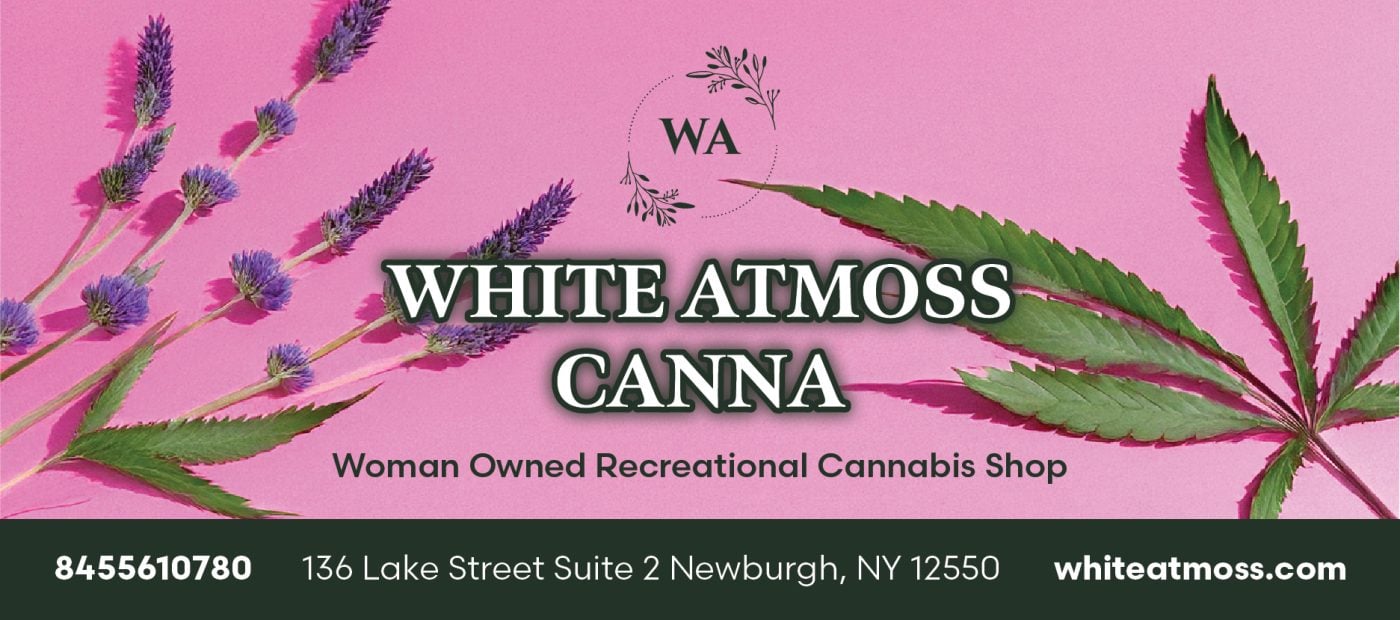
The illustration wraps the board rather than sitting inside it, with cannabis leaves and magenta celosia growing in from the corners of a soft blush field and a small monogram above the name. The wordmark is a fine serif and reads like a shop you would browse. The line underneath does two jobs, naming the category and giving somebody a reason to pick this one. A dark green bar along the bottom gathers the phone number, the address and the website into one place.

The idea you can borrow

One honest line about who you are gives people a reason to choose you rather than just somewhere to buy. It costs a single line of type.

3Ten minutes, measured from where you are

Spark'd Dispensary cannabis billboard campaign in Kenosha, WI
Spark'd Dispensary cannabis billboard campaign in Kenosha, WI, installed See it on the road Kenosha, WI
Advertiser
Spark'd Dispensary
Format
Bulletin
Market
Kenosha, WI
Ran
December 2023

Why it works

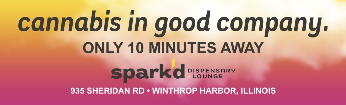
The gradient runs yellow through blue into deep pink with no hard edges, so from a distance the board reads as one warm glow. The lowercase headline keeps the tone conversational, and the line under it handles the practical part, only 10 minutes away. What makes that work is where the board sits, on 120th Avenue beside the Welcome to Illinois sign, so the drive time is measured from exactly where the reader is. The full street address runs in white along the bottom for anyone ready to act on it.

The idea you can borrow

If your customer has to cross town or a state line to reach you, the drive time is usually a stronger message than anything about the product. Put the number where the drive starts.

4A considered brand, and blunt directions

Ivy Hall Dispensary cannabis billboard campaign in Hoffman Estates, IL
Ivy Hall Dispensary cannabis billboard campaign in Hoffman Estates, IL, installed See it on the road Hoffman Estates, IL
Advertiser
Ivy Hall Dispensary
Format
Bulletin, static
Market
Hoffman Estates, IL
Ran
October 2024

Why it works

The palette does the positioning. Forest green, cream and a dusty pink pack read like an old apothecary, and the vintage serif wordmark gets its own cream panel cut at an angle. Under it, next exit in plain bold capitals, which is right for the one thing a driver has to act on. The town and the street address follow in white at the same weight as the category, so the board works whether somebody is turning off now or looking it up later. The product shot stays small in the corner and adds texture without competing.

The idea you can borrow

You can look like a considered retail brand and still be blunt about directions. Give the brand its own panel and set the instruction in plain capitals.

5Tie dye that still reads

Northern Grow cannabis billboard campaign in Mora, MN
Northern Grow cannabis billboard campaign in Mora, MN, installed See it on the road Mora, MN
Advertiser
Northern Grow
Format
Junior Poster, static
Market
Mora, MN
Ran
May 2025

Why it works

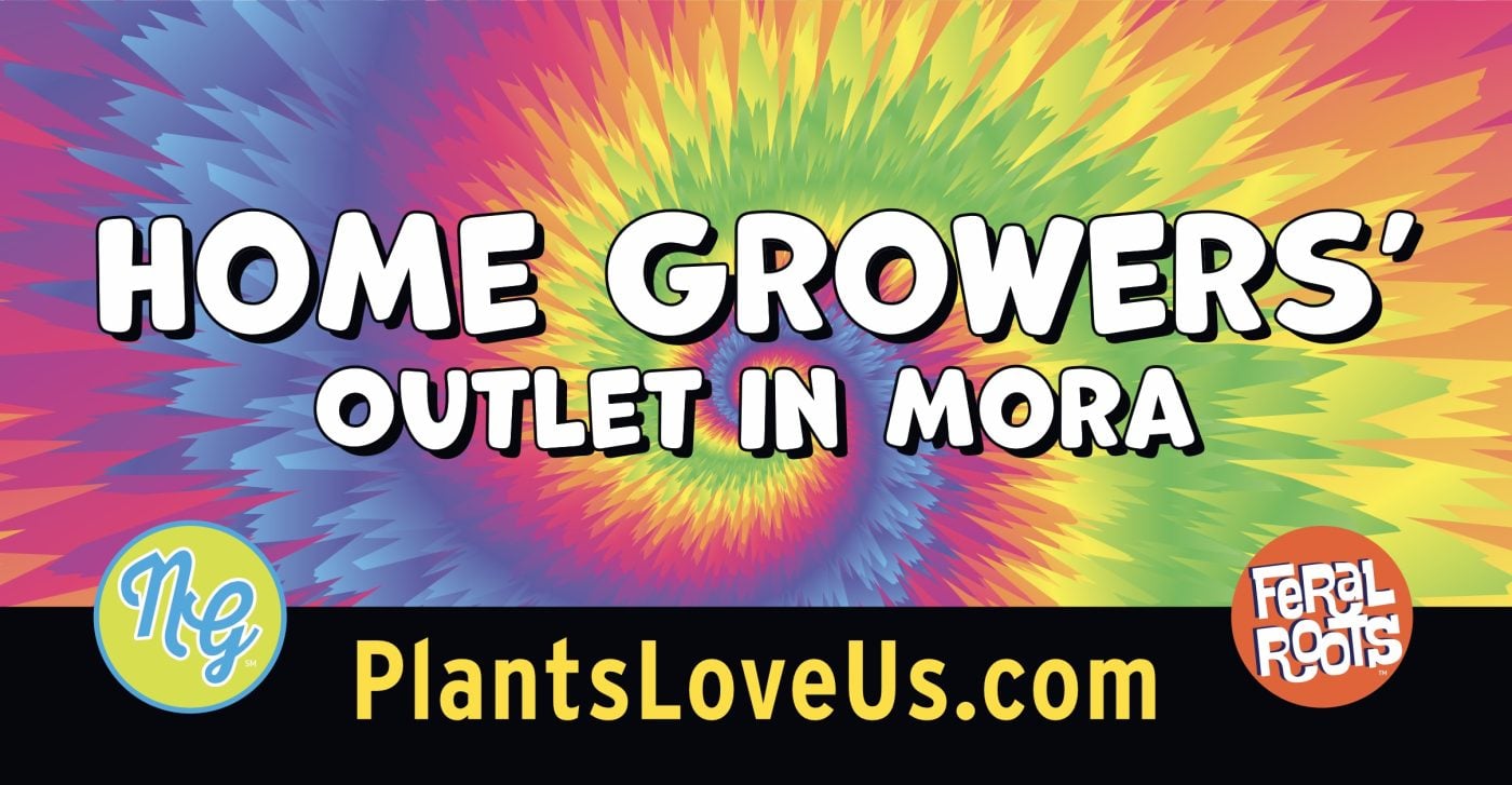
A tie dye spiral is about as busy as a background gets, and the type still wins. The headline is heavy rounded capitals in white with a dark outline, so it holds its shape over every color in the swirl. A dark band across the bottom gives the web address a calm strip to sit in, and setting it in yellow keeps it the brightest thing down there. The town name in the headline does the local work in two words. The board speaks to home growers rather than everybody, which tells a specific audience the stop is for them.

The idea you can borrow

A busy background is fine as long as one element is built to sit on top of it. Outline the type and give the small print a quiet band of its own.

6Name, category, address, and nothing else

Smokehouse Dispensary cannabis billboard campaign in Ingleside, IL
Smokehouse Dispensary cannabis billboard campaign in Ingleside, IL, installed See it on the road Ingleside, IL
Advertiser
Smokehouse Dispensary
Format
Bulletin
Market
Ingleside, IL
Ran
August 2024

Why it works

This is the most pared back board on the page and it's better for it. Deep navy behind white condensed capitals gives the highest contrast here, and there are only three things to read: the name, the category and the address. That address is 44 S US Highway 12, so the board tells people on that road they are already on it. The logo earns its space by looking like where it is, a boat crossing in front of a dock under a low sun, which is Fox Lake in one picture. A thin coral rule keeps the brand and the address line from blurring together at speed.

The idea you can borrow

A highway number turns a billboard into a road sign. If your customers are already on that road, tell them so.

What the best cannabis billboards have in common

Every campaign above ran through Alluvit Media. We secured the space, the board went up, and we photographed it after install, so these are real boards on real streets rather than concept art. Looking across them, the same handful of things keep showing up:

  • One idea. Carried in few enough words to land in the seconds a driver actually has.
  • Type you can read at distance. Heavy enough letters, real contrast behind them, and one color that pulls the eye where it needs to go.
  • Built for a billboard. Work that could only be a billboard, rather than a print ad or a social post enlarged to fit one.
  • One thing to do next. A website, a phone number, or an address, set large enough to remember.
  • It sounds like the advertiser. Creative that sounds like the business behind it and says what they actually wanted said.
  • The right road. A board on a road the right audience already drives, with a message built for that market.

Free design support when you need it

Don't have a graphic design team? No problem. Our designers will create an attention-grabbing ad at no extra cost. All we need from you is a logo and a rough idea of what you want to say.

Some of the advertisers above sent us their own artwork, and that's fine too. Either way, we compare your design to the specs of the actual board to ensure its resolution and that it reads well from the road. We're checking that it holds up after dark, that the type is big enough to catch from that far back, and that there aren't more words than a driver has time for.

Common questions

How much does a cannabis billboard cost?

It depends on the market, the format, and how long you run, which is why we built a billboard cost calculator that gives you a real number instead of a range. Put in a city and a budget and it'll show you what that buys.

How many words should a billboard have?

Seven or fewer is the number most of the boards above land on. A driver gets somewhere between four and six seconds, and that has to cover the message, the brand, and where to go next. The campaigns that read fastest are the ones that picked one idea and let the design carry the rest.

Can we use one of these designs?

The artwork belongs to the advertiser who ran it, so treat these as reference rather than templates. The ideas underneath them travel perfectly well. If you want us to design yours, that comes at no extra cost, and if you'd rather supply your own artwork we'll check it against the specs for the board either way.

Ready to run your own campaign?

Tell us the market and the budget, and we'll come back with what it buys.

Request your proposal