Eye Care Billboard Ad Ideas and Examples

What’s unique about eye care billboards?

Eye care is a routine appointment people put off until something reminds them. A billboard is that reminder, delivered to everyone driving past the practice.

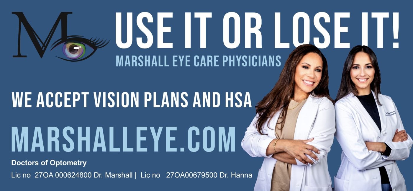
An eye exam is the appointment people keep meaning to make. Nothing forces it, so the board has to supply the reason, and the two sharpest ones here point at money that runs out. Use it or lose it. Use your FSA before the end of the year. Benefits have a deadline even when your eyesight doesn't, and a deadline is what turns a reminder into a phone call.

The other thing you'll notice is the faces. Four of these five put the doctors on the board, which is more than any other page here. People pick an eye doctor the way they pick a dentist, by deciding they trust somebody, and a photograph starts that before a word gets read.

Jump to an example
  1. Plain white, and one instruction
  2. One procedure, and the word local
  3. Use it or lose it, explained on the next line
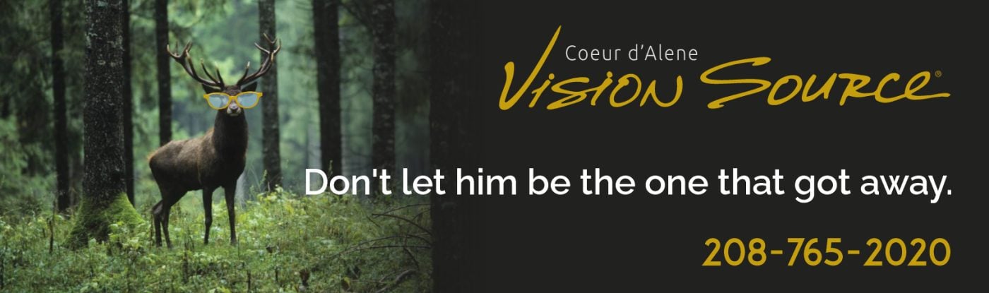
  4. A hunting joke, on a road through hunting country
  5. A new doctor up top, an FSA deadline below

1Plain white, and one instruction

Gulf Coast Eye Institute eye care billboard campaign in Eagle Pass, TX
Gulf Coast Eye Institute eye care billboard campaign in Eagle Pass, TX, installed See it on the road Eagle Pass, TX
Advertiser
Gulf Coast Eye Institute
Format
Bulletin
Market
Eagle Pass, TX
Ran
February 2024

Why it works

White is the useful choice here. Most of what surrounds a board on a commercial road is dark or busy, and a white ground with navy type reads from further back than anything clever would. The alternating words in light blue are a small trick that gives you care and eye at a glance. Schedule your appointment today sits in a blue bar of its own, so the instruction isn't folded into the headline. The phone number underneath is the only way to act, which keeps the decision simple. The two doctors are photographed inside a yellow ringed circle on the right, and in a town the size of Eagle Pass those are faces people recognize.

The idea you can borrow

Give the instruction its own band. A headline and a call to action set in the same block read as one long sentence, and the part you want people to act on is the part that gets lost in it.

2One procedure, and the word local

John L. Bonner Eye Clinic eye care billboard campaign in Grand Rapids, MN
John L. Bonner Eye Clinic eye care billboard campaign in Grand Rapids, MN, installed See it on the road Grand Rapids, MN
Advertiser
John L. Bonner Eye Clinic
Format
Junior Poster
Market
Grand Rapids, MN
Ran
May 2023

Why it works

Your local cataract surgeon is three words of positioning and one word of category. Cataract surgery is the kind of thing people in a small town assume means a drive to the city, and local answers that before anybody asks. It names one procedure rather than eye care in general, which narrows the audience on purpose. That's the right call when the procedure is the one paying for the board. Dr. Mariano is photographed at the right with his name beside him, because a surgeon is somebody you choose rather than a service you buy. Quality care in Grand Rapids and Hibbing names both towns, and the sage band along the bottom carries the web address.

The idea you can borrow

If people assume your service means a drive to the city, local is the headline. Pair it with the one procedure you want and the board has said who it's for and why they can stay put.

3Use it or lose it, explained on the next line

Marshall EyeCare Physicians eye care billboard campaign in Holmdel, NJ
Marshall EyeCare Physicians eye care billboard campaign in Holmdel, NJ, installed See it on the road Holmdel, NJ
Advertiser
Marshall EyeCare Physicians
Format
Poster
Market
Holmdel, NJ
Ran
November 2022

Why it works

Use it or lose it is a phrase everybody knows already, and this board borrows it to mean vision benefits that expire at the end of the year. The explanation sits a line below, we accept vision plans and HSA, so nobody has to work out what is being lost. That order is the whole design. The line that makes you look comes first, and the line that makes sense of it comes second. MARSHALLEYE.COM is set nearly as large as the headline and is the only route on the board, which fits a practice people will look up later rather than call from the car. Two optometrists stand at the right in white coats, and the license numbers along the bottom are unusual on a billboard, though they do mark this as a medical practice rather than a store.

The idea you can borrow

A phrase people already know buys you the glance. Put the explanation on the next line so the board still works for anybody who hasn't connected it to your category yet.

4A hunting joke, on a road through hunting country

Coeur d'Alene Vision Source eye care billboard campaign in Osburn, ID
Coeur d'Alene Vision Source eye care billboard campaign in Osburn, ID, installed See it on the road Osburn, ID
Advertiser
Coeur d'Alene Vision Source
Format
Bulletin
Market
Osburn, ID
Ran
November 2021

Why it works

A stag standing in the timber with a pair of yellow glasses on, and don't let him be the one that got away. It's a hunting joke, and it works because of where the board stands, a mountain road in north Idaho with snow on the hills behind it. Everybody driving past knows somebody who has told that story. The board splits down the middle, photograph on the left and near black on the right, so the gold script and the white line each get clean ground. There's no address and no web address, just a phone number in gold. That tells you this board is about being remembered rather than booking somebody this week.

The idea you can borrow

A joke only works if it belongs to the people driving past. Write it out of what they do on the weekend and the board stops sounding like an advertisement.

5A new doctor up top, an FSA deadline below

The Mann Eye Institute eye care billboard campaign in Bay City, TX
The Mann Eye Institute eye care billboard campaign in Bay City, TX, installed See it on the road Bay City, TX
Advertiser
The Mann Eye Institute
Format
Poster
Market
Bay City, TX
Ran
August 2022

Why it works

Two messages, split by a hard line across the middle. The top half is the news, welcome Dr. Audrey Graham, which in a town the size of Bay City is a real thing to announce. A new eye doctor means appointments that weren't there last month. The bottom half is the reason to call this week, use your FSA before the end of the year, set in a white pill against the navy so it reads as its own piece. Dr. Graham is photographed at the right across both halves, which keeps the board from looking like two boards stacked up. The brush script and the italic serif are warmer than the type on most medical boards, and that suits an introduction.

The idea you can borrow

A board can carry news and a deadline at the same time if each one gets its own half. The news is what gets noticed and the deadline is what gets the call.

What the best eye care billboards have in common

Every campaign above ran through Alluvit Media. We secured the space, the board went up, and we photographed it after install, so these are real boards on real streets rather than concept art. Looking across them, the same handful of things keep showing up:

  • One idea. Carried in few enough words to land in the seconds a driver actually has.
  • Type you can read at distance. Heavy enough letters, real contrast behind them, and one color that pulls the eye where it needs to go.
  • Built for a billboard. Work that could only be a billboard, rather than a print ad or a social post enlarged to fit one.
  • One thing to do next. A website, a phone number, or an address, set large enough to remember.
  • It sounds like the advertiser. Creative that sounds like the business behind it and says what they actually wanted said.
  • The right road. A board on a road the right audience already drives, with a message built for that market.

Free design support when you need it

Don't have a graphic design team? No problem. Our designers will create an attention-grabbing ad at no extra cost. All we need from you is a logo and a rough idea of what you want to say.

Some of the advertisers above sent us their own artwork, and that's fine too. Either way, we compare your design to the specs of the actual board to ensure its resolution and that it reads well from the road. We're checking that it holds up after dark, that the type is big enough to catch from that far back, and that there aren't more words than a driver has time for.

Common questions

How much does an eye care billboard cost?

It depends on the market, the format, and how long you run, which is why we built a billboard cost calculator that gives you a real number instead of a range. Put in a city and a budget and it'll show you what that buys.

How many words should a billboard have?

Seven or fewer is the number most of the boards above land on. A driver gets somewhere between four and six seconds, and that has to cover the message, the brand, and where to go next. The campaigns that read fastest are the ones that picked one idea and let the design carry the rest.

Can we use one of these designs?

The artwork belongs to the advertiser who ran it, so treat these as reference rather than templates. The ideas underneath them travel perfectly well. If you want us to design yours, that comes at no extra cost, and if you'd rather supply your own artwork we'll check it against the specs for the board either way.

Ready to run your own campaign?

Tell us the market and the budget, and we'll come back with what it buys.

Request your proposal