Nonprofit Billboard Ad Ideas and Examples

What’s unique about nonprofit billboards?

A nonprofit board often has a very pointed focus: address the intended audience and motivate them to act. All of this has to happen in a blip of time so an effective creative is a must.

170+ nonprofit campaigns we ran
90+ nonprofit advertisers
40+ US markets

Most of the organizations here are aiming their message at a particular group of people rather than a general market. That changes what the creative has to do. The board is usually near the neighborhood it serves, so it reaches everyone who lives there, including the neighbor who passes the information along. You will see the same handful of decisions over and over on this page: name the audience outright, answer the question that would otherwise stop someone from calling, and give the phone number or the web address the same weight as the headline.

Jump to an example
  1. The URL is part of the headline
  2. Four colored squares instead of a list
  3. A surprising claim, then one thing to do
  4. One question sorts the audience
  5. Two languages on one board
  6. Four objects show what you can donate
  7. The headline answers the objection
  8. Football wording, beside a football stadium
  9. The price and distance are right upfront
  10. One community, one issue, highlighted in red
  11. The phone number is the second biggest thing
  12. A distance you can judge from the beach
  13. Artwork made for one community
  14. Free comes first

1The URL is part of the headline

Saahas for Cause nonprofit billboard campaign in Los Angeles, CA
Saahas for Cause nonprofit billboard campaign in Los Angeles, CA, installed See it on the road Los Angeles, CA
Advertiser
Saahas for Cause
Format
Poster
Market
Los Angeles, CA
Ran
June 2023

Why it works

White type on a solid green panel is very readable, even from a fast-moving car. The web address is set in navy at nearly the same size as the headline, so you catch it in the same look that gets you the message. It's impossible to miss. The headline reads like something a person would actually say, which suits the subject, and the county health department logo at the bottom gives it credibility.

The idea you can borrow

If you want people to go somewhere, the address has to be readable at speed. It's often better to cut words from the headline than to shrink the URL.
2Four colored squares instead of a list

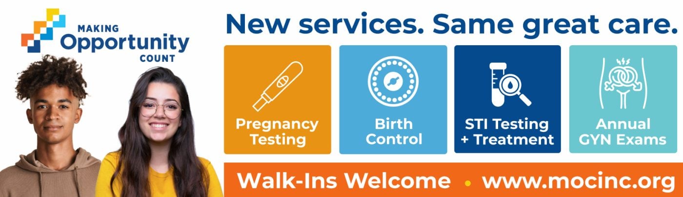
Making Opportunity Count nonprofit billboard campaign in Fitchburg, MA
Making Opportunity Count nonprofit billboard campaign in Fitchburg, MA, installed See it on the road Fitchburg, MA
Advertiser
Making Opportunity Count
Format
Bulletin
Market
Fitchburg, MA
Ran
April 2025

Why it works

Two people on the left draw you in, then four colored squares, each holding one service with a simple icon, make the services clear. You take it in as a picture before you read it as words, which is easier to take in at speed. The orange bar along the bottom carries Walk-Ins Welcome and the URL, and that shade of orange appears nowhere else on the board, so your eye finishes there. That's the part you drive away with.

The idea you can borrow

If you have several services to show, give each one a color and an icon rather than a line of copy.

3A surprising claim, then one thing to do

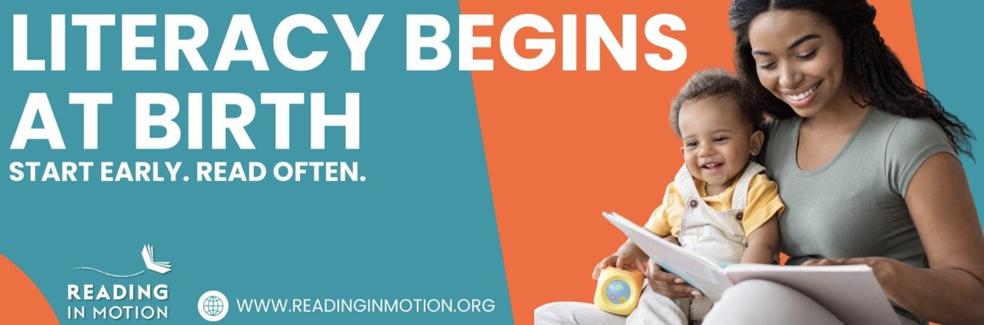
Reading In Motion nonprofit billboard campaign in Las Vegas, NV
Reading In Motion nonprofit billboard campaign in Las Vegas, NV, installed See it on the road Las Vegas, NV
Advertiser
Reading In Motion
Format
Digital Billboard
Market
Las Vegas, NV
Ran
June 2024

Why it works

White on deep teal holds up well on a digital face after dark. The headline is a claim most people won't expect, and that's enough to earn a second look. Four words underneath say what to do about it. The photo of a parent reading to their child sits off to one side, backing the line up instead of competing with it.

The idea you can borrow

If you have a fact that surprises people, lead with it and follow it straight away with the one thing you want them to do.

4One question sorts the audience

San Gabriel/Pomona Regional Center nonprofit billboard campaign in La Puente, CA
San Gabriel/Pomona Regional Center nonprofit billboard campaign in La Puente, CA, installed See it on the road La Puente, CA
Advertiser
San Gabriel/Pomona Regional Center
Format
Bulletin, static
Market
La Puente, CA
Ran
March 2025

Why it works

"Are you 55+?" does the targeting on its own. The people it's for know in the first second that it's aimed at them. Red and navy on cream reads civic and trustworthy, right for a volunteer program tied to a national service organization. Two people in branded shirts, both the right age for a reader to picture themselves standing there. Phone number and web address both shown, which an older audience appreciates.

The idea you can borrow

A question that names your audience does more than any amount of description. Say who you're talking to and the right people lean in.

5Two languages on one board

CASA of Ventura County nonprofit billboard campaign in Oxnard, CA
CASA of Ventura County nonprofit billboard campaign in Oxnard, CA, installed See it on the road Oxnard, CA
Advertiser
CASA of Ventura County
Format
Poster, static
Market
Oxnard, CA
Ran
March 2026

Why it works

A child looking straight down the road, which does more than a headline would. The navy behind her keeps the white type clean. The second line is in Spanish, on the same board, in the same tone, so one poster reaches the whole market instead of splitting the buy across two creatives. The red strip at the top holds the name and gives your eye somewhere to start.

The idea you can borrow

In a bilingual market you often don't need two boards. One line in each language, same layout, same voice, covers it.

6Four objects show what you can donate

Goodwill Keystone Area nonprofit billboard campaign in Ivyland, PA
Goodwill Keystone Area nonprofit billboard campaign in Ivyland, PA, installed See it on the road Ivyland, PA
Advertiser
Goodwill Keystone Area
Format
Digital Billboard
Market
Ivyland, PA
Ran
May 2025

Why it works

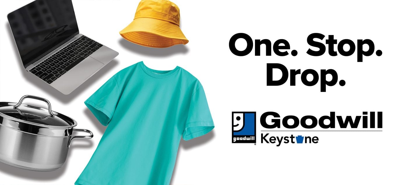
Four everyday things on a white field, a laptop, a pot, a t-shirt and an orange hat, and between them they tell you what you can donate without a line of explanation. Three words do the rest. The hat is the only strong color and it sits on the path your eye takes toward the logo.

The idea you can borrow

The empty space is doing work. Objects can replace an explanation, and the fewer words on the board, the further out it still reads.

7The headline answers the objection

Northern Arizona Council of Governments, Area Agency on Aging nonprofit billboard campaign in Ash Fork, AZ
Northern Arizona Council of Governments, Area Agency on Aging nonprofit billboard campaign in Ash Fork, AZ, installed See it on the road Ash Fork, AZ
Advertiser
Northern Arizona Council of Governments, Area Agency on Aging
Format
Bulletin
Market
Ash Fork, AZ
Ran
March 2022

Why it works

Navy on white, which is the cleanest contrast you can get on a board. The headline takes the objection straight on rather than arguing around it. The photograph has multiple generations in one frame, which makes the point about every age group without stating it. The red bar along the bottom is the only color on the board and it carries the URL, so you finish where the action is. The link goes to a vaccine page rather than a homepage.

The idea you can borrow

If you already know why people say no, put the answer in the biggest type. It does more than an argument underneath would.

8Football wording, beside a football stadium

New Hope, Inc. nonprofit billboard campaign in Foxborough, MA
New Hope, Inc. nonprofit billboard campaign in Foxborough, MA, installed See it on the road Foxborough, MA
Advertiser
New Hope, Inc.
Format
Digital Billboard
Market
Foxborough, MA
Ran
January 2025

Why it works

Gold on a dark stadium photograph, high contrast, holds up at night. The board stands beside the stadium, so the football wording is doing real work rather than reaching for a metaphor. The white band underneath carries two ways to act: a URL for someone who wants to understand the issue and a phone number for someone who needs help now. The link goes to the trafficking page rather than the homepage.

The idea you can borrow

Tell us where the board is going before the artwork is finished. A message built for that road will outperform the same file hung anywhere.

9The price and distance are right upfront

Texas Coalition for Animal Protection nonprofit billboard campaign in Joshua, TX
Texas Coalition for Animal Protection nonprofit billboard campaign in Joshua, TX, installed See it on the road Joshua, TX
Advertiser
Texas Coalition for Animal Protection
Format
Junior Poster, static
Market
Joshua, TX
Ran
October 2025

Why it works

The $5 is the biggest thing on the board, and that's the right call, because price is the biggest question most people have. The cat and the dog are depicted on the same dark background so they sit inside the design rather than on top of it, and both are looking at you. Underneath, 1 mile away and the street address. That's what turns a passing thought into a stop.

The idea you can borrow

Price and distance answer the two things standing between somebody and a visit. If you have a good number on either, put it in the biggest type.

10One community, one issue, highlighted in red

Carolinas Care Partnership nonprofit billboard campaign in Belmont, NC
Carolinas Care Partnership nonprofit billboard campaign in Belmont, NC, installed See it on the road Belmont, NC
Advertiser
Carolinas Care Partnership
Format
Bulletin, static
Market
Belmont, NC
Ran
April 2025

Why it works

"Opioid misuse" stands out in red while all other text on the board is white. That's why it works at speed: your eye goes to the subject first and the rest fills in after. The photograph is five young people standing together, which frames prevention as something a community does rather than a warning pointed at the individual. That's a warmer way into a hard subject. The URL sits in the clear space above the group where there's nothing behind it to fight with.

The idea you can borrow

On a busy photograph, pick the two or three words that matter most and give them a color that appears nowhere else on the board.

11The phone number is the second biggest thing

Telamon TRC nonprofit billboard campaign in Eden, MD
Telamon TRC nonprofit billboard campaign in Eden, MD, installed See it on the road Eden, MD
Advertiser
Telamon TRC
Format
Bulletin, static
Market
Eden, MD
Ran
September 2024

Why it works

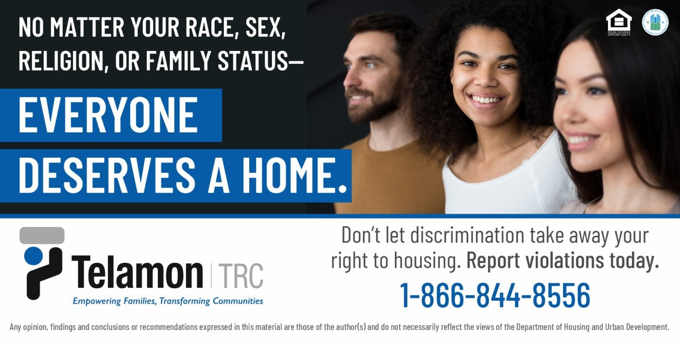
The dark top and the blue bar split this into a setup and a payoff, so you read through the opening and land on the line that says what the organization is for. Three faces on the right represent the people the law protects. The phone number is the largest thing after the headline and it's made up of repeating numbers so it's easy to remember.

The idea you can borrow

Required legal language can live in the small type. Give the human sentence the color, the contrast, and the space.

12A distance you can judge from the beach

The Marine Mammal Stranding Center nonprofit billboard campaign in Atlantic City, NJ
The Marine Mammal Stranding Center nonprofit billboard campaign in Atlantic City, NJ, installed See it on the road Atlantic City, NJ
Advertiser
The Marine Mammal Stranding Center
Format
Bulletin
Market
Atlantic City, NJ
Ran
November 2022

Why it works

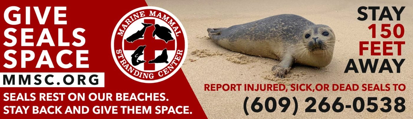
Red and white stays legible against a gray coastal sky. The seal in the middle is the proof that makes you take the instruction seriously. Three words carry the headline, and the number is what makes it usable, because 150 feet is something a person can judge while standing on a beach. The reporting number sits right beside it, which is where you need it in that moment.

The idea you can borrow

Give people a number they can act on. A specific distance or a time beats a vague request, because nobody has to guess what you meant.

13Artwork made for one community

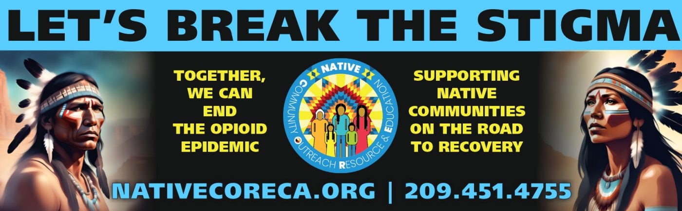
Native CORE nonprofit billboard campaign in Stockton, CA
Native CORE nonprofit billboard campaign in Stockton, CA, installed See it on the road Stockton, CA
Advertiser
Native CORE
Format
Bulletin
Market
Stockton, CA
Ran
November 2023

Why it works

The cyan band across the top catches you from far away, and the black behind everything else keeps the yellow type sharp. The artwork is made for the community the message is for, so those readers recognize it as theirs before they read a word. The word "Let's" makes it an invitation rather than an instruction. The URL and phone number sit together at the bottom in the same cyan that pulled you in.

The idea you can borrow

Artwork made for a specific community tells the right people the message is theirs before they have read it.

14Free comes first

Transforming Reentry Services/MWIPM nonprofit billboard campaign in Chicago, IL
Transforming Reentry Services/MWIPM nonprofit billboard campaign in Chicago, IL, installed See it on the road Chicago, IL
Advertiser
Transforming Reentry Services/MWIPM
Format
Bulletin, static
Market
Chicago, IL
Ran
October 2024

Why it works

Free is first and it's the biggest word on the board, which clears the barrier before anything else gets a chance to raise it. The palette is plain, gray with red, and that restraint is what keeps everything legible. Two street addresses instead of a website, which suits a service where the hard part is knowing where you can walk in. The red logo block on the left holds the layout together.

The idea you can borrow

Put whatever removes the hesitation first. For most services that's the price, or the fact that there's not one.

What the best nonprofit billboards have in common

No matter what your mission is, nonprofits need to achieve a few things when advertising outdoors to ensure their message is seen, understood, and actionable. Looking across the nonprofit campaigns we've helped launch, the same handful of things make these boards strong:

  • One idea. Carried in few enough words to land in the seconds a driver actually has.
  • Type you can read at distance. Heavy enough letters, real contrast behind them, and one color that pulls the eye where it needs to go.
  • Built for a billboard. Work that could only be a billboard, rather than a print ad or a social post enlarged to fit one.
  • One thing to do next. A website, a phone number, or an address, set large enough to remember.
  • It sounds like the advertiser. Creative that sounds like the business behind it and says what they actually wanted said.
  • The right road. A board on a road the right audience already drives, with a message built for that market.

Free design support when you need it

Don't have a graphic design team? No problem. Our designers will create an attention-grabbing ad at no extra cost. All we need from you is a logo and a rough idea of what you want to say.

Some of the advertisers above sent us their own artwork, and that's fine too. Either way, we compare your design to the specs of the actual board to ensure its resolution and that it reads well from the road. We're checking that it holds up after dark, that the type is big enough to catch from that far back, and that there aren't more words than a driver has time for.

Common questions

How much does a nonprofit billboard cost?

It depends on the market, the format, and how long you run, which is why we built a billboard cost calculator that gives you a real number instead of a range. Put in a city and a budget and it'll show you what that buys.

How many words should a billboard have?

Seven or fewer is the number most of the boards above land on. A driver gets somewhere between four and six seconds, and that has to cover the message, the brand, and where to go next. The campaigns that read fastest are the ones that picked one idea and let the design carry the rest.

Can we use one of these designs?

The artwork belongs to the advertiser who ran it, so treat these as reference rather than templates. The ideas underneath them travel perfectly well. If you want us to design yours, that comes at no extra cost, and if you'd rather supply your own artwork we'll check it against the specs for the board either way.

Ready to run your own campaign?

Tell us the market and the budget, and we'll come back with what it buys.

Request your proposal