Retail Billboard Ad Ideas and Examples

What’s unique about retail billboards?

Retail is a business of being close by and being easy to find. A billboard reaches people while they are already out driving, and it keeps working on the days when nobody is shopping, so the store is familiar before anyone needs it.

70+ retail campaigns we ran
40+ retail advertisers
30+ US markets

The person deciding where to shop is usually already in the car, and a board sits inside that moment without asking anybody to look something up or hold a name in their head for later.

The boards on this page do one of three things. They show the product. They carry news, like an opening or a price. Or they handle the practical problem of getting there, with an address, a landmark, or a picture of the storefront so you recognize it when you arrive. Several of them do more than one.

Jump to an example
  1. Five tubes in a row on one flat color
  2. The mascot delivers the opening news
  3. A photo of the shopfront, not a logo
  4. The web address is in the middle, not the edge
  5. Borrowed colors from the brand they sell
  6. An aerial shot of the lot
  7. Black space on a lit face
  8. A sandy dog and a set of directions
  9. 107 years, and a mostly white board
  10. The photograph makes the headline literal
  11. Oprah's name first, the ranch's name last

1Five tubes in a row on one flat color
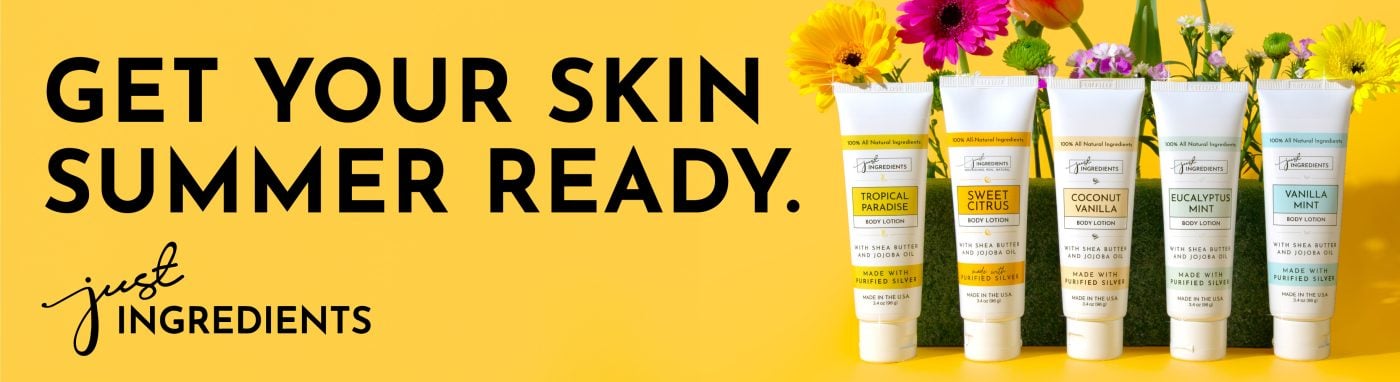
Just Ingredients retail billboard campaign in Mesa, AZ
Just Ingredients retail billboard campaign in Mesa, AZ, installed See it on the road Mesa, AZ
Advertiser
Just Ingredients
Format
Digital Billboard
Market
Mesa, AZ
Ran
June 2024

Why it works

One flat yellow field with the headline in black. That's about as much contrast as you can get without going to white. The five tubes stand in a row on the right, one for each scent. A row like that shows the range in a single look instead of describing it. There's no phone number and no web address. That suits a product people buy online, and a name short enough to remember to the next light.

The idea you can borrow

A product line photographs better as a set than as one item. A row shows the range, the sizes and the packaging in a single look, and nobody has to read a list.
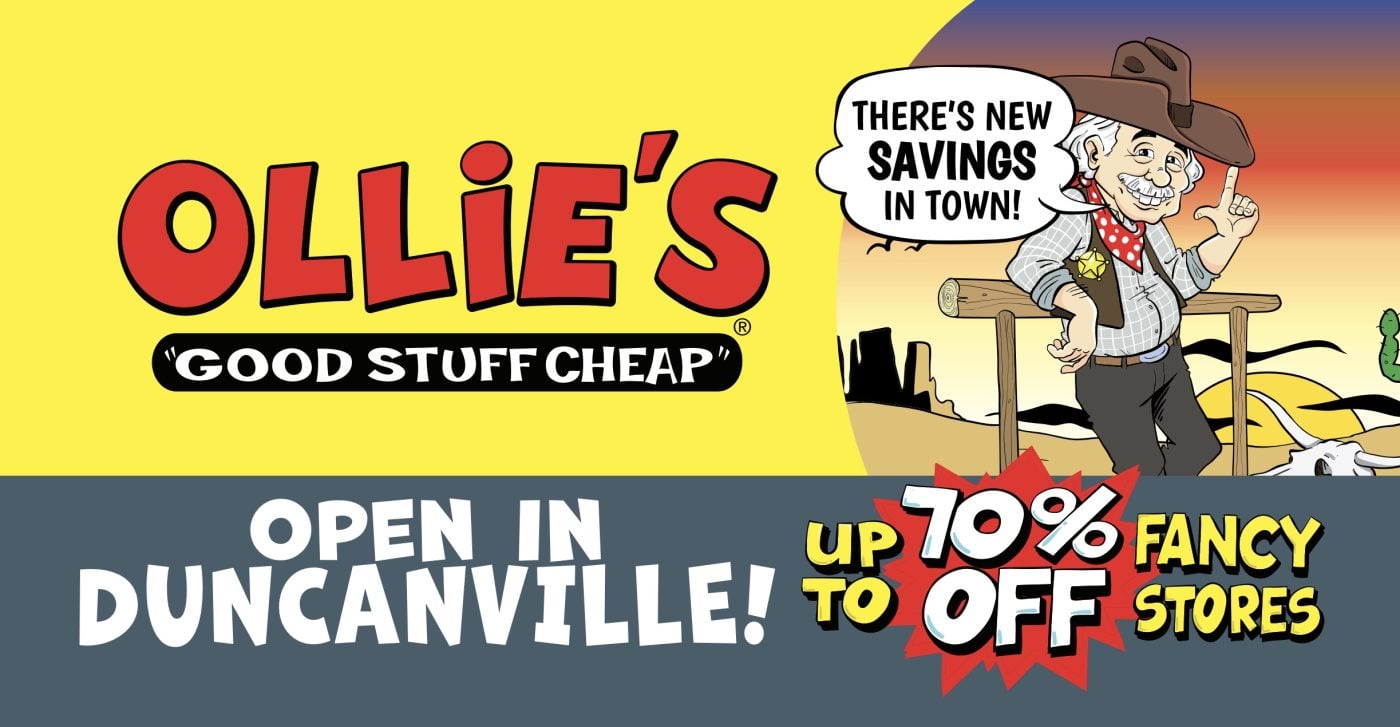
2The mascot delivers the opening news

Ollie's retail billboard campaign in Dallas, TX
Ollie's retail billboard campaign in Dallas, TX, installed See it on the road Dallas, TX
Advertiser
Ollie's
Format
Poster, static
Market
Dallas, TX
Ran
September 2024

Why it works

Red on yellow is the loudest pairing on that road. The mascot delivers the news out of a speech bubble, so you read it as somebody talking rather than as a line of copy. The slate band across the bottom carries the only two things an opening needs: which town, and how much you save. The starburst behind seventy percent off is why your eye lands there first.

The idea you can borrow

An opening is one of the few times a retailer has genuinely new information. Say where, say the number, and let the brand carry the rest.

3A photo of the shopfront, not a logo

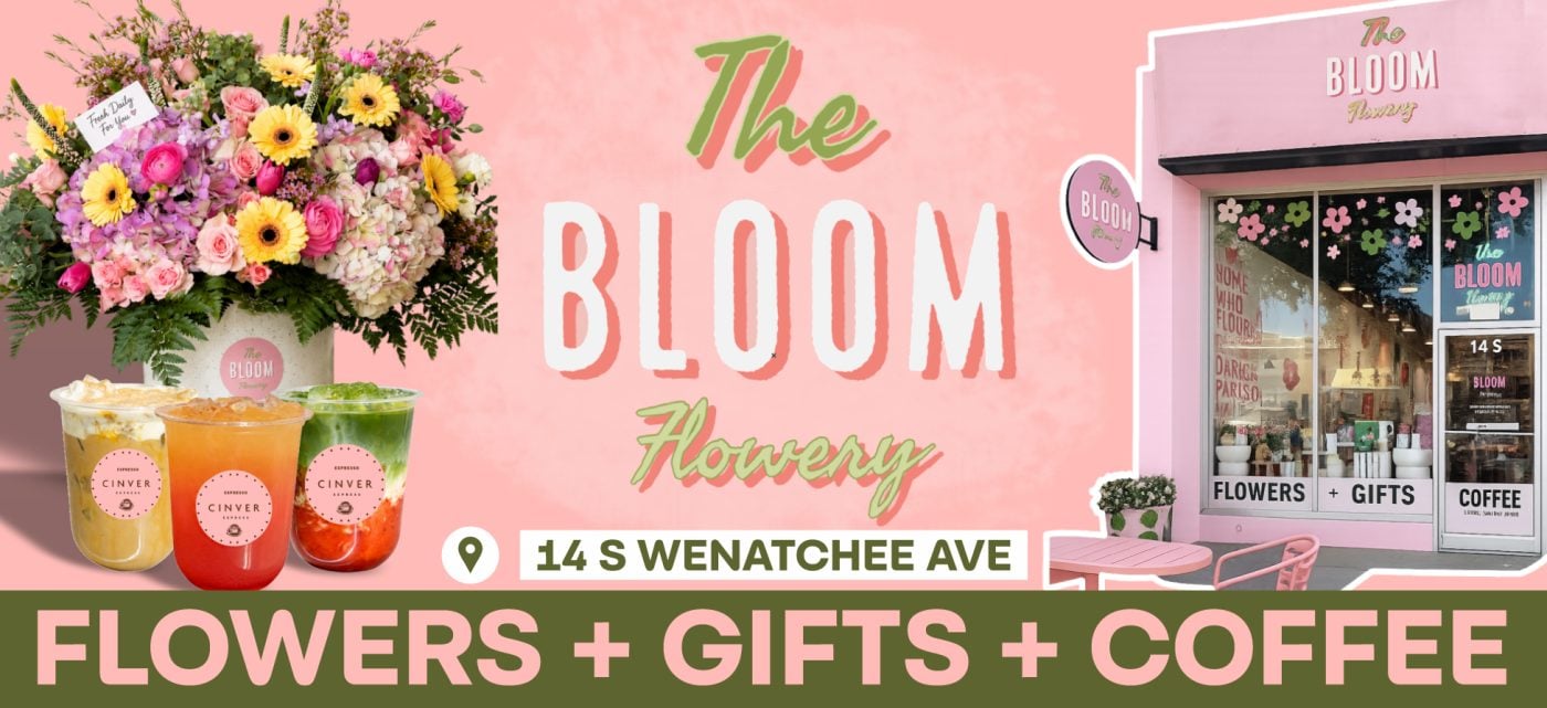
The Bloom Flowery retail billboard campaign in Wenatchee, WA
The Bloom Flowery retail billboard campaign in Wenatchee, WA, installed See it on the road Wenatchee, WA
Advertiser
The Bloom Flowery
Format
Poster
Market
Wenatchee, WA
Ran
June 2026

Why it works

The picture of the shopfront on the right is the most useful thing here. Somebody arriving on that street is looking for a pink building with flowers in the window, not a street number. The address sits in a white pill with a map pin and has that space to itself. The green band along the bottom is the only cool color on an otherwise pink board, which is why flowers, gifts and coffee reads first. The bouquet and the iced drinks are photographed so the products still look like products.

The idea you can borrow

For a shop on a main street, a picture of the storefront beats a logo. People navigate by what a place looks like.

4The web address is in the middle, not the edge

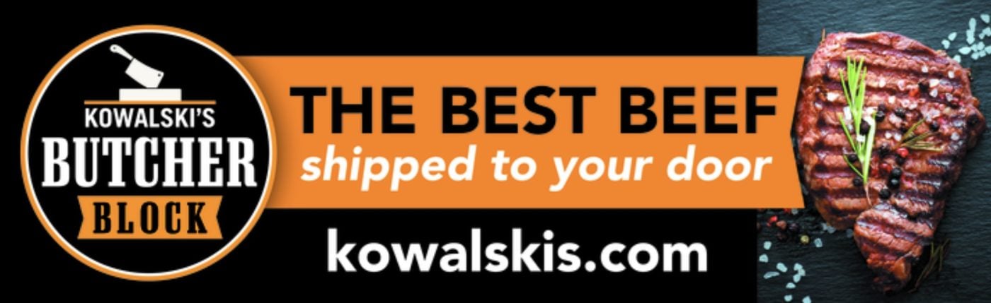
Kowalski’s Markets retail billboard campaign in Bonita Springs, FL
Kowalski’s Markets retail billboard campaign in Bonita Springs, FL, installed See it on the road Bonita Springs, FL
Advertiser
Kowalski’s Markets
Format
Bulletin
Market
Bonita Springs, FL
Ran
January 2022

Why it works

Black and gold is a butcher's palette. The steak is lit the way food gets lit, rather than pulled off a stock site. The claim is four words and the line under it explains the offer in five more. The web address runs across the middle in white at nearly the size of the headline. It sits there rather than small along the bottom edge, so you take in the address in the same look that gets you the message. The round logo on the left reads like a seal on something made by hand.

The idea you can borrow

If the product photographs well, give it a large portion of the board. One good picture of the thing itself does more than any adjective you could fit in the same space.

5Borrowed colors from the brand they sell

Mac Daddy Sales and Services Co, Inc. retail billboard campaign in Land O' Lakes, FL
Mac Daddy Sales and Services Co, Inc. retail billboard campaign in Land O' Lakes, FL, installed See it on the road Land O' Lakes, FL
Advertiser
Mac Daddy Sales and Services Co, Inc.
Format
Bulletin, static
Market
Land O' Lakes, FL
Ran
January 2025

Why it works

Black and yellow is the palette of the mowers this shop sells. The board reads as part of that brand before you reach the name. The line through the middle says exactly what the business does in six words. A hand drawn arrow curves back from it to the mower, which is the one thing on the board worth looking at. The authorized dealer badge is what turns a small shop into a safe choice. The yellow band along the bottom holds an email and a phone number, in black type big enough to catch at speed.

The idea you can borrow

If you sell a brand people already trust, use its colors and say you're authorized. You inherit the credibility instead of building it.

6An aerial shot of the lot

Liberty RV Sales retail billboard campaign in Chippewa Park, OH
Liberty RV Sales retail billboard campaign in Chippewa Park, OH, installed See it on the road Chippewa Park, OH
Advertiser
Liberty RV Sales
Format
Poster, static
Market
Chippewa Park, OH
Ran
April 2026

Why it works

The aerial does something a studio photograph cannot, which is prove the claim. You can count the units. Beside it, one park model is shot close enough to see the porch rail and the window trim. You get the scale and the detail in the same look. Blue and white keeps it clean, and the phone number is set in gold, so your eye finishes on the thing to act on. Along the bottom, huge inventory, the number, and we take trades answer the three questions somebody shopping for one of these actually has.

The idea you can borrow

If you have the stock, photograph the lot. A picture of the real thing is worth more than the words huge inventory.

7Black space on a lit face

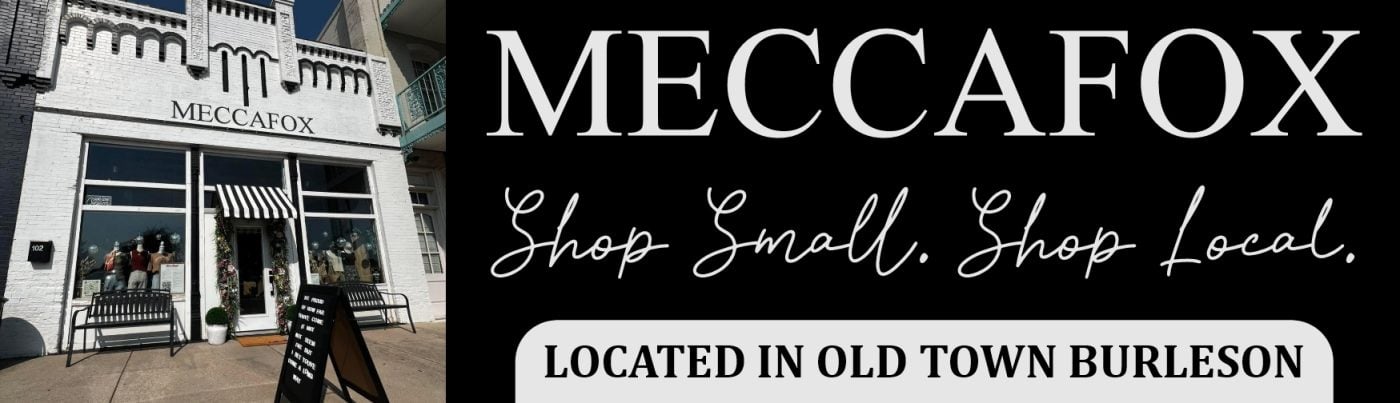
Meccafox retail billboard campaign in Burleson, TX
Meccafox retail billboard campaign in Burleson, TX, installed See it on the road Burleson, TX
Advertiser
Meccafox
Format
Digital Billboard
Market
Burleson, TX
Ran
January 2026

Why it works

The right half goes black and lets a serif name and a script line carry it, which reads as confidence on a lit face. The white pill at the bottom holds the location. It's the only solid shape on that half, so it gets read. The storefront photograph on the left does the wayfinding, showing the striped awning and the benches a shopper will be looking for. Shop small, shop local is a line a town this size responds to. It's set in a hand that looks written rather than typed, which is part of why.

The idea you can borrow

On digital, black space and one clean typeface will stand out more than another bright color, because everything around it is already bright.

8A sandy dog and a set of directions

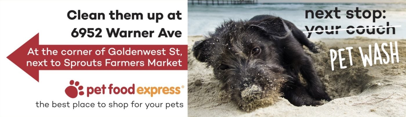
Pet Food Express retail billboard campaign in HUNTINGTN BCH, CA
Pet Food Express retail billboard campaign in HUNTINGTN BCH, CA, installed See it on the road HUNTINGTN BCH, CA
Advertiser
Pet Food Express
Format
Bulletin, static
Market
HUNTINGTN BCH, CA
Ran
October 2024

Why it works

The right half is a dog covered in sand on the beach. Across it, next stop, your couch, with your couch struck through and replaced by pet wash. You have the whole idea before you read a word of the other half. That half is all directions: the street address, a red arrow, the cross street, and the name of the supermarket next door. A landmark rather than only a number is what makes it usable at speed. Keeping that side white keeps it readable next to a busy photograph.

The idea you can borrow

Show the problem your customer already knows, then make the answer easy to reach. An arrow and a nearby landmark do more than an address on its own.

9107 years, and a mostly white board

Kimbrell’s Furniture retail billboard campaign in Greensboro, NC
Kimbrell’s Furniture retail billboard campaign in Greensboro, NC, installed See it on the road Greensboro, NC
Advertiser
Kimbrell’s Furniture
Format
Bulletin
Market
Greensboro, NC
Ran
March 2023

Why it works

The whole board is white, which holds the eye among boards that are all trying to be bright. The sofa is photographed against that white so the shape and the fabric stay clear. "107 years but we're finally here" is set with "finally here" in red, so the point lands even if you only catch two words. And we saved you a seat ties the line to the sofa.

The idea you can borrow

A long history only helps if you give people a reason to care about it today. A board that's mostly white also stands out whatever the weather.

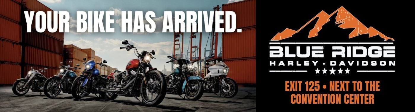
10The photograph makes the headline literal

Russom's Blue Ridge Harley-Davidson retail billboard campaign in Icard, NC
Russom's Blue Ridge Harley-Davidson retail billboard campaign in Icard, NC, installed See it on the road Icard, NC
Advertiser
Russom's Blue Ridge Harley-Davidson
Format
Bulletin, static
Market
Icard, NC
Ran
December 2025

Why it works

"Your bike has arrived" works because the bikes are lined up in front of stacked shipping containers. It reads as a delivery that just happened rather than as a slogan. Five bikes in a row also answers the question somebody shopping has, which is whether there's anything to go and look at. The right third goes black and gives the brand and the directions a panel of their own. Exit 125 and next to the convention center are set in the same orange as the mountain mark, so the two halves of the address read as one thing.

The idea you can borrow

If the picture can make the headline literal, let it. The line and the photograph together say more than either would alone, and that frees the rest of the board for directions.

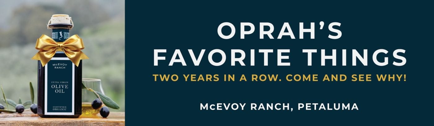
11Oprah's name first, the ranch's name last

McEvoy Ranch retail billboard campaign in Rohnert Park, CA
McEvoy Ranch retail billboard campaign in Rohnert Park, CA, installed See it on the road Rohnert Park, CA
Advertiser
McEvoy Ranch
Format
Bulletin, static
Market
Rohnert Park, CA
Ran
October 2025

Why it works

Oprah's Favorite Things takes two lines across the top, and the ranch's own name is the smallest thing on the board. That's the right order when the endorsement is better known than you are. Two years in a row is the line doing the quiet work underneath it, because one year reads as luck and two reads as a record. Then "come and see why" turns a recommendation into a reason to drive somewhere or order online. The gold bow on the bottle handles the gift framing without spending a word on it. The navy behind the type is lifted straight off the label.

The idea you can borrow

If somebody well known has endorsed you, give them the headline and put your own name last. What you ask for next is the part worth thinking about, because an endorsement that ends in a visit is worth more than one that ends in a logo.

What the best retail billboards have in common

Every campaign above ran through Alluvit Media. We secured the space, the board went up, and we photographed it after install, so these are real boards on real streets rather than concept art. Looking across them, the same handful of things keep showing up:

  • One idea. Carried in few enough words to land in the seconds a driver actually has.
  • Type you can read at distance. Heavy enough letters, real contrast behind them, and one color that pulls the eye where it needs to go.
  • Built for a billboard. Work that could only be a billboard, rather than a print ad or a social post enlarged to fit one.
  • One thing to do next. A website, a phone number, or an address, set large enough to remember.
  • It sounds like the advertiser. Creative that sounds like the business behind it and says what they actually wanted said.
  • The right road. A board on a road the right audience already drives, with a message built for that market.

Free design support when you need it

Don't have a graphic design team? No problem. Our designers will create an attention-grabbing ad at no extra cost. All we need from you is a logo and a rough idea of what you want to say.

Some of the advertisers above sent us their own artwork, and that's fine too. Either way, we compare your design to the specs of the actual board to ensure its resolution and that it reads well from the road. We're checking that it holds up after dark, that the type is big enough to catch from that far back, and that there aren't more words than a driver has time for.

Common questions

How much does a retail billboard cost?

It depends on the market, the format, and how long you run, which is why we built a billboard cost calculator that gives you a real number instead of a range. Put in a city and a budget and it'll show you what that buys.

How many words should a billboard have?

Seven or fewer is the number most of the boards above land on. A driver gets somewhere between four and six seconds, and that has to cover the message, the brand, and where to go next. The campaigns that read fastest are the ones that picked one idea and let the design carry the rest.

Can we use one of these designs?

The artwork belongs to the advertiser who ran it, so treat these as reference rather than templates. The ideas underneath them travel perfectly well. If you want us to design yours, that comes at no extra cost, and if you'd rather supply your own artwork we'll check it against the specs for the board either way.

Ready to run your own campaign?

Tell us the market and the budget, and we'll come back with what it buys.

Request your proposal