Real Estate Billboard Ad Ideas and Examples

What’s unique about real estate billboards?

Real estate is local in a way almost nothing else is. The home or the community being advertised is usually a few minutes from the board, so somebody can pass the billboard and pass the actual place on the same trip.

40+ real estate campaigns we ran
30+ real estate advertisers
20+ US markets

Nearly every board here shows the real building rather than a stand-in, and nearly every one tells you how to get to it, with an exit, a street name, or an arrow with the turn written inside it.

The numbers are the other half. A starting price, a monthly payment, or a rent is what somebody weighing a move wants to know before they call anybody. The ones that work hardest also say who the place is for, so a 55+ community or a three bedroom rental sorts its own audience while you drive past.

Jump to an example
  1. The dog says pet friendly
  2. The price is the headline
  3. A line aimed at almost nobody
  4. The copy gets a panel of its own
  5. The pool on the left, the turn on the right
  6. The web address gets the bottom third
  7. The monthly payment, not the price
  8. The headline explains an unfamiliar offer
  9. Two circles showing the inside

1The dog says pet friendly
Crescent by Arium real estate billboard campaign in Summerfield, FL
Crescent by Arium real estate billboard campaign in Summerfield, FL, installed See it on the road Summerfield, FL
Advertiser
Crescent by Arium
Format
Bulletin
Market
Summerfield, FL
Ran
April 2024

Why it works

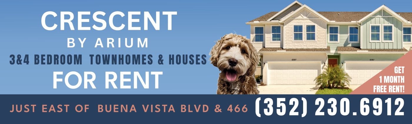
The photograph tells you what you're renting and the dog tells you the rest. A shaggy goldendoodle leans into the frame between the copy and the townhomes, and it says pet friendly without spending a word on it. The type stays plain over the sky blue: the community name, then what's available in one line, then FOR RENT at the size that carries. A coral corner flag holds the offer on its own so it doesn't crowd the headline. The navy band along the bottom gives the cross streets and the phone number a quiet strip to sit in.

The idea you can borrow

One warm image can carry a selling point your copy would need a whole line for. If pets, families or a view are part of the offer, show them and spend the words somewhere else.
2The price is the headline

Esperanza Homes real estate billboard campaign in Laredo, TX
Esperanza Homes real estate billboard campaign in Laredo, TX, installed See it on the road Laredo, TX
Advertiser
Esperanza Homes
Format
Bulletin
Market
Laredo, TX
Ran
January 2025

Why it works

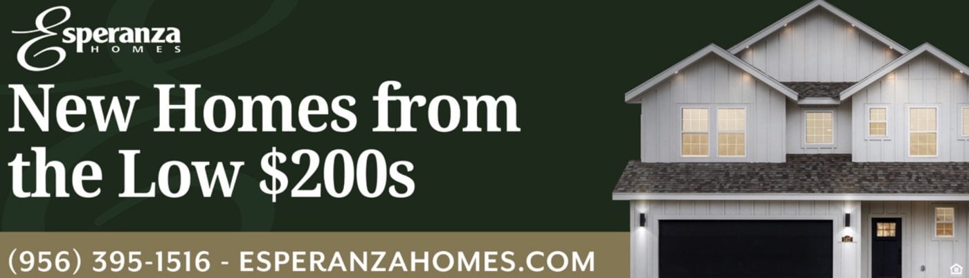
New Homes from the Low $200s is the whole headline, and it's the first thing anybody shopping for a house wants to know. Set in a white serif against dark green, it has more contrast than anything else on the board, so the price reads at distance before the brand does. The house on the right is photographed at dusk with the lights on, which shows what that money buys and makes it look lived in. The band at the bottom carries the phone number and the web address at matching size, so either route is equally easy to take.

The idea you can borrow

A starting price is a qualifier, not a giveaway. It filters out the people who were never going to call and pulls in the ones who were.

3A line aimed at almost nobody

Tina Alzaga Real Estate real estate billboard campaign in Northeast Portland, OR
Tina Alzaga Real Estate real estate billboard campaign in Northeast Portland, OR, installed See it on the road Northeast Portland, OR
Advertiser
Tina Alzaga Real Estate
Format
Poster
Market
Northeast Portland, OR
Ran
May 2024

Why it works

Hey Powerball winner is aimed at almost nobody, which is exactly why everybody reads it. The real pitch is the line underneath, have you ever considered Idaho, aimed at anyone already thinking about leaving a more expensive state. Two aerial photographs of large houses set the price bracket without quoting a number. The agent stands on the right in a cut out that breaks above the gold band. That's how residential real estate works, because people hire a person rather than a company. The navy strip at the bottom gives the phone number and the web address the same size and nothing else.

The idea you can borrow

A headline aimed at a tiny group gets read by everybody, as long as the line underneath is the real message. Put your face on the board too, because in residential real estate people are choosing a person.

4The copy gets a panel of its own

Pennrose Management Company real estate billboard campaign in East Wareham, MA
Pennrose Management Company real estate billboard campaign in East Wareham, MA, installed See it on the road East Wareham, MA
Advertiser
Pennrose Management Company
Format
Digital Billboard
Market
East Wareham, MA
Ran
February 2025

Why it works

The copy gets a white panel of its own on the left rather than sitting over the photograph, which is what keeps it readable on a digital face seen at speed. Wareham's Hidden Gem is the headline, and the line underneath sorts the audience in six words: affordable senior 62+ and family apartments. The aerial on the right shows the whole community rather than one building. Along the purple band, three icons for equal housing, accessibility and pets answer three common questions without a sentence, and the web address and phone number sit beside them.

The idea you can borrow

When the property photographs well, make it the layout. Copy placed in the quietest corner of a strong image still gets read.

5The pool on the left, the turn on the right

Colina Ranch Hill real estate billboard campaign in San Antonio, FL
Colina Ranch Hill real estate billboard campaign in San Antonio, FL, installed See it on the road San Antonio, FL
Advertiser
Colina Ranch Hill
Format
Bulletin
Market
San Antonio, FL
Ran
July 2024

Why it works

Two panels, two jobs. The left two thirds is a photograph of the pool and the clubhouse with the community name over it, which is the reason to want the place. The right third turns apricot and gets practical: now open, a navy arrow with Right on Old Pasco Rd written inside it, and the phone number underneath. The road name sits inside the arrow rather than beside it, so the instruction reads as one shape. A coral strip along the bottom carries the category and a cream strip carries the web address.

The idea you can borrow

A board can sell and direct at the same time if each job gets its own territory. Draw the line down the middle and change the colors with it.

6The web address gets the bottom third

Epcon Nashville real estate billboard campaign in Smyrna, TN
Epcon Nashville real estate billboard campaign in Smyrna, TN, installed See it on the road Smyrna, TN
Advertiser
Epcon Nashville
Format
Bulletin, static
Market
Smyrna, TN
Ran
April 2025

Why it works

EpconNashville.com runs the entire width in white caps on navy and is easily the largest thing on the board. Everything above it is arranged to send you there: the logo panel, a blue block reading 55+ community and luxury ranch homes, and a photograph of residents together on a patio. Two words name the audience and do the sorting. The photograph answers what living there feels like rather than what the house looks like.

The idea you can borrow

If the web address is the only action you want, size it like it. A URL given a third of the board is one people can still recall at the next light.

7The monthly payment, not the price

Home Path Financial real estate billboard campaign in Jackson, WI
Home Path Financial real estate billboard campaign in Jackson, WI, installed See it on the road Jackson, WI
Advertiser
Home Path Financial
Format
Bulletin
Market
Jackson, WI
Ran
January 2025

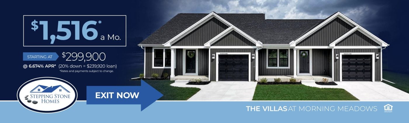
Why it works

$1,516 a month sits in blue inside a white outlined box and is the biggest thing on the board. It's the number a buyer measures against their own budget. The detail runs underneath in descending sizes: the starting price, the rate, the down payment and the loan amount, with the rates subject to change line in the smallest type. A blue arrow reading exit now points at the photograph of the home, so the instruction and the product share the same half of the board.

The idea you can borrow

Lead with the number your customer does the math on. For a home that's usually the monthly payment, and the supporting figures underneath build trust without slowing the read.

8The headline explains an unfamiliar offer

Tricon Residential real estate billboard campaign in Mt. Juliet, TN
Tricon Residential real estate billboard campaign in Mt. Juliet, TN, installed See it on the road Mt. Juliet, TN
Advertiser
Tricon Residential
Format
Bulletin, static
Market
Mt. Juliet, TN
Ran
January 2025

Why it works

New homes for rent is the entire proposition, and it earns the space. A newly built single family house you rent rather than buy isn't what most people assume they're looking at. A photograph of one of the houses takes the left third, separated from the navy panel by a pale blue diagonal that keeps the two halves from feeling stacked. Under the headline, a thin rule and one quiet line give the community's street and the phone number.

The idea you can borrow

When the offer is unfamiliar, spend the headline explaining it rather than dressing it up. If the category itself is the news, clarity is the idea.

9Two circles showing the inside

Lynd Living Ashcroft Southbury real estate billboard campaign in Oswego, IL
Lynd Living Ashcroft Southbury real estate billboard campaign in Oswego, IL, installed See it on the road Oswego, IL
Advertiser
Lynd Living Ashcroft Southbury
Format
Bulletin
Market
Oswego, IL
Ran
October 2023

Why it works

Two circular cut outs sit over the exterior photograph and show the living room and the kitchen, so you get a look inside a home you're passing at speed. That's the detail that makes this one stick. A dark circle on the left carries homes for lease and the starting rent, which keeps the offer readable against a busy photograph. The gray band underneath gathers the web address, the phone number and the street address. The web address is the largest thing in it, which is right when the name of the place and the site are the same words.

The idea you can borrow

The inside is what people are actually deciding on. Two small interior shots will do more than a bigger picture of the front door.

What the best real estate billboards have in common

Every campaign above ran through Alluvit Media. We secured the space, the board went up, and we photographed it after install, so these are real boards on real streets rather than concept art. Looking across them, the same handful of things keep showing up:

  • One idea. Carried in few enough words to land in the seconds a driver actually has.
  • Type you can read at distance. Heavy enough letters, real contrast behind them, and one color that pulls the eye where it needs to go.
  • Built for a billboard. Work that could only be a billboard, rather than a print ad or a social post enlarged to fit one.
  • One thing to do next. A website, a phone number, or an address, set large enough to remember.
  • It sounds like the advertiser. Creative that sounds like the business behind it and says what they actually wanted said.
  • The right road. A board on a road the right audience already drives, with a message built for that market.

Free design support when you need it

Don't have a graphic design team? No problem. Our designers will create an attention-grabbing ad at no extra cost. All we need from you is a logo and a rough idea of what you want to say.

Some of the advertisers above sent us their own artwork, and that's fine too. Either way, we compare your design to the specs of the actual board to ensure its resolution and that it reads well from the road. We're checking that it holds up after dark, that the type is big enough to catch from that far back, and that there aren't more words than a driver has time for.

Common questions

How much does a real estate billboard cost?

It depends on the market, the format, and how long you run, which is why we built a billboard cost calculator that gives you a real number instead of a range. Put in a city and a budget and it'll show you what that buys.

How many words should a billboard have?

Seven or fewer is the number most of the boards above land on. A driver gets somewhere between four and six seconds, and that has to cover the message, the brand, and where to go next. The campaigns that read fastest are the ones that picked one idea and let the design carry the rest.

Can we use one of these designs?

The artwork belongs to the advertiser who ran it, so treat these as reference rather than templates. The ideas underneath them travel perfectly well. If you want us to design yours, that comes at no extra cost, and if you'd rather supply your own artwork we'll check it against the specs for the board either way.

Ready to run your own campaign?

Tell us the market and the budget, and we'll come back with what it buys.

Request your proposal